5 min to read
x2 Progress Wizard Components
Some more brand new components to talk about

Welcome
So I been keeping myself really busy and I actually built these components before releasing the video course which is mentioned in my previous blog. Building this particular type of component has been on my component radar for sometime now. However as I am on furlough I have recently had more time to look at components and try building some components I been wanting to build for a while.
What Do These Components Do?
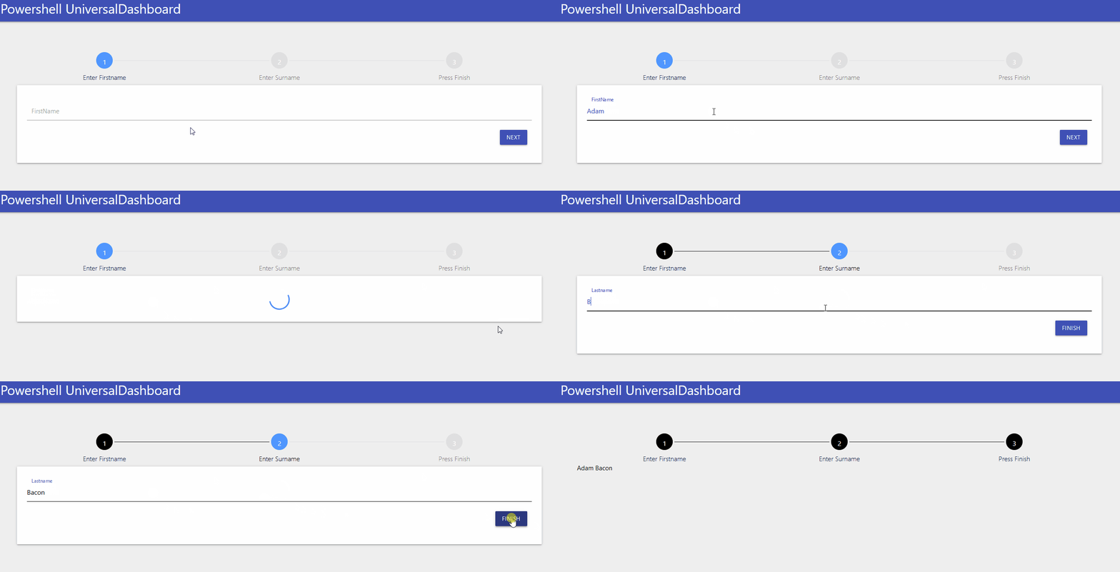
Again I know this particular type of component is in Powershell Universal, but for those old skool dashboarders still running on just UniversalDashboard there is nothing quite like this. I believe in the new UD v3 it is called UD-Stepper, which is what I was going to call mine, but I couldn’t as I saw that name was taxed, plus I was struggling to get the original one I was working on, working. So I looked for an easier option, got that component working, then re-visited the other component. So when your on a web site and they have put their input form into multiple stages you normally get some sort of progress wizard appear along the top to show you how many more steps you need to complete before the form is fully completed. So this is my spin on this type of component x2.
So Why Build x2 Of The Same Component?
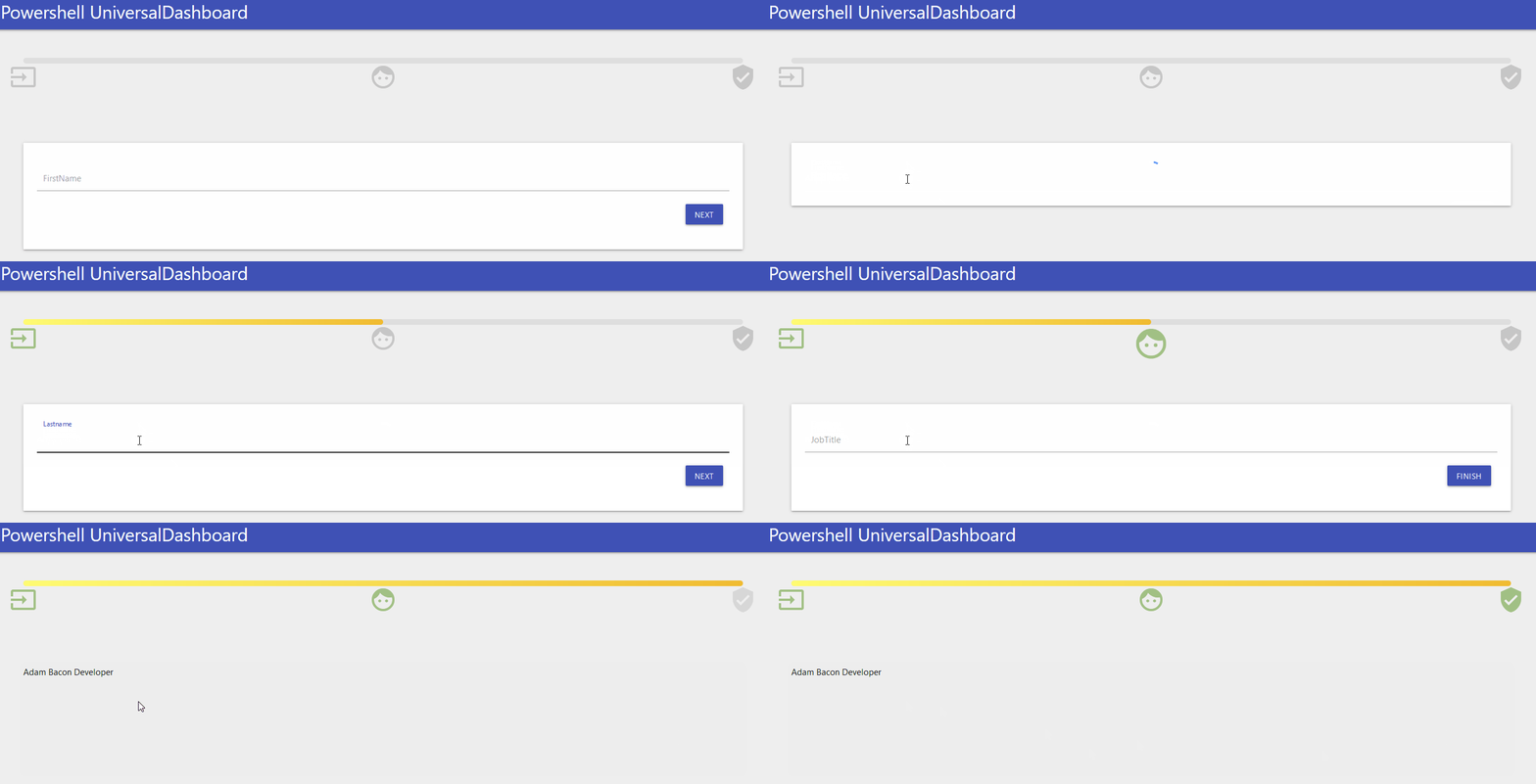
If you didn’t realise by now I do like a bit of animation. So one of these components is animated, and the other is not animated. They both have completely different looks and feel, and the way you actually control the component is completely different, the non-animated one is a lot easier to pass your parameters to, but the animated version has custom icon steps you can provide, and animate at each stage, so hence the parameter and passing the information is slightly more complex than the non-animated component. The non-animated version is called New-UDStepBar and the animated version is called New-UDStepProgressBar and has a sub-component called New-UDStep
New-UDStepBar
Parameters
param(
        [Parameter()]
        [string]$Id = (New-Guid).ToString(),
        [Parameter()]
        [int]$ActiveStep = 0,
        [Parameter()]
        [string]$CircleActiveColor = "#5096FF",
        [Parameter()]
        [string]$CircleCompletedColor = "#000",
        [Parameter()]
        [string]$CircleDefaultColor = "#E0E0E0",
        [Parameter()]
        [string]$TitleActiveColor = "#000",
        [Parameter()]
        [string]$TitleCompletedColor = "#00183D",
        [Parameter()]
        [string]$CircleFontColor = "#FFF",
        [Parameter()]
        [int]$CircleSize = 36,
        [Parameter()]
        [int]$CircleFontSize = 16,
        [Parameter()]
        [int]$TitleFontSize = 16,
        [Parameter()]
        [int]$DefaultBorderWidth = 0,
        [Parameter(Mandatory)]
        [scriptblock]$Steps
As always I try to give as many defaults as I can to my parameters so the component pretty much needs the minimal parameters supplying to it. By default you only need to define one parameter for this component which is the -Steps parameter which is passed as a scriptblock and you just need to define a hash table in the script-block. So let me show you the demo file I cooked up for this:-
Demo
Import-Module -Name UniversalDashboard
Import-Module -Name UniversalDashboard.UDStepBar
$init = New-UDEndpointInitialization -Module 'UniversalDashboard.UDStepBar'
Get-UDDashboard | Stop-UDDashboard
Start-UDDashboard -Port 10005 -Dashboard (
    New-UDDashboard -Title "Powershell UniversalDashboard" -Content {
        New-UDStepBar -Id "STEPPER_COMPONENT" -Steps {
            @{"title" = "Enter Firstname" },
            @{"title" = "Enter Surname" },
            @{"title" = "Press Finish" }
        } -ActiveStep 0 -CircleSize 40 -CircleCompletedColor "#000"
        New-UDInput -Endpoint {
            param($FirstName)
            Set-UDElement -Id "STEPPER_COMPONENT" -Attributes @{activeStep = 1 }
            New-UDInputAction -Content {
                New-UDInput -Endpoint {
                    param($Lastname)
                    Set-UDElement -Id "STEPPER_COMPONENT" -Attributes @{activeStep = 2 }
                    New-UDInputAction -Content {
                        New-UDHeading -Text "$FirstName $LastName"
                        Set-UDElement -Id "STEPPER_COMPONENT" -Attributes @{activeStep = 3 }
                    }
                } -SubmitText "Finish"
            }
        } -SubmitText "Next"
    } -EndpointInitialization $init
)

New-UDStepProgressBar & New-UDStep
Ok I know it is a bit of a mouthful and doesn’t flow off the tip of your tongue, but the New-UDStepProgressBar is literally an animated progressbar so the New-UDStep is the thing that allows you to place the steps onto the progress bar, and decide when to animate and what icon to choose.
New-UDStepProgressBar Parameters
    param(
        [Parameter()]
        [string]$Id = (New-Guid).ToString(),
        [Parameter()]
        [int]$Percent = 0,
        [Parameter()]
        [scriptblock]$Content,
        [Parameter()]
        [string]$FilledBackground,
        [Parameter()]
        [string]$UnfilledBackground,
        [Parameter()]
        [string]$Width = "100%",
        [Parameter()]
        [int]$Height = 10
    )
New-UDStep Parameters
param(
        [Parameter()]
        [string]$Id = (New-Guid).ToString(),
        [Parameter()]
        [string]$ClassName,
        [Parameter()]
        [int]$Position,
        [Parameter()]
        [int]$Width = 35,
        [Parameter()]
        [bool]$CanBegin = $false,
        [Parameter()]
        [string]$Icon = "check_circle",
        [Parameter()]
        [int]$IconSize = 48,
        [Parameter()]
        [string]$IconColor = "#F3752B",
        [Parameter()]
        [int]$IconTopMargin = 0
    )
Yep I know that is a lot to digest, and if you were sensible enough to purchase my video course for £20 on building custom components then you also get the JSX files to these two projects, which will show you where I got them from and all the parameters are explained on those pages…
Demo
Import-Module -Name UniversalDashboard
Import-Module -Name UniversalDashboard.UDStep
Import-Module -Name UniversalDashboard.UDStepProgressBar
Import-Module -Name UniversalDashboard.Helmet
$init = New-UDEndpointInitialization -Module @('UniversalDashboard.UDStepProgressBar', 'UniversalDashboard.UDStep')
Get-UDDashboard | Stop-UDDashboard
Start-UDDashboard -Port 10005 -Dashboard (
    New-UDDashboard -Title "Powershell UniversalDashboard" -Content {
        New-UDHelmet -Content {
            New-UDHtmlTag -Tag 'link' -Attributes @{
                rel  = "stylesheet"
                href = 'https://fonts.googleapis.com/icon?family=Material+Icons'
            }
        }
        New-UDStepProgressBar -Id "STEP_PROGRESS" -Percent 0 -FilledBackground "linear-gradient(to right, #fefb72, #f0bb31)" -Content {
            New-UDStep -Id "Step1" -ClassName "Step1" -Position 0 -Icon "input" -IconTopMargin 60
            New-UDStep -Id "Step2" -ClassName "Step2" -Position 50 -Icon "face" -IconTopMargin 60
            New-UDStep -Id "Step3" -ClassName "Step3" -Position 100 -Icon "verified_user" -IconTopMargin 60
        }
        New-UDRow ###Just to add some nice separation between this input form and the progress bar
        New-UDRow
        New-UDRow
        New-UDRow
        New-UDRow
        New-UDRow
        New-UDRow
        New-UDInput -Endpoint {
            param($FirstName)
            Set-UDElement -Id "STEP_PROGRESS" -Attributes @{percent = 50 }
            Set-UDElement -Id "Step1" -Attributes @{canBegin = $true }
            Set-UDElement -Id "Step1" -Attributes @{color = "#A1C084" }
            New-UDInputAction -Content {
                New-UDInput -Endpoint {
                    param($Lastname)
                    Set-UDElement -Id "Step2" -Attributes @{canBegin = $true }
                    Set-UDElement -Id "Step2" -Attributes @{color = "#A1C084" }
                    New-UDInputAction -Content {
                        New-UDInput -Endpoint {
                            param($JobTitle)
                            Set-UDElement -Id "STEP_PROGRESS" -Attributes @{percent = 100 }
                            Set-UDElement -Id "Step3" -Attributes @{canBegin = $true }
                            Set-UDElement -Id "Step3" -Attributes @{color = "#A1C084" }
                            New-UDInputAction -Content {
                                New-UDHeading -Text "$FirstName $LastName $JobTitle"
                            }
                        } -SubmitText "Finish"
                    }
                } -SubmitText "Next"
            }
        } -SubmitText "Next"

    } -EndpointInitialization $init
)

Conclusion
I will be posting these to the powershell gallery very soon, I will make New-UDStepProgressBar a required module for New-UDStep as you need this for the latter to work. I hope you have enjoyed this blog and that these components find a way to the dashboard you have built or are working on. Once again thanks for reading.

