4 min to read
Light And Dark Mode
Another component that has been on my to-do list


Welcome
Felt really pleased to have released my video course which I know I will not be able to retire on, but the main point is some people have bought it, and with the feedback received, I added some additional video content, and I have added a load of custom components, as templates to help you build your own custom component.
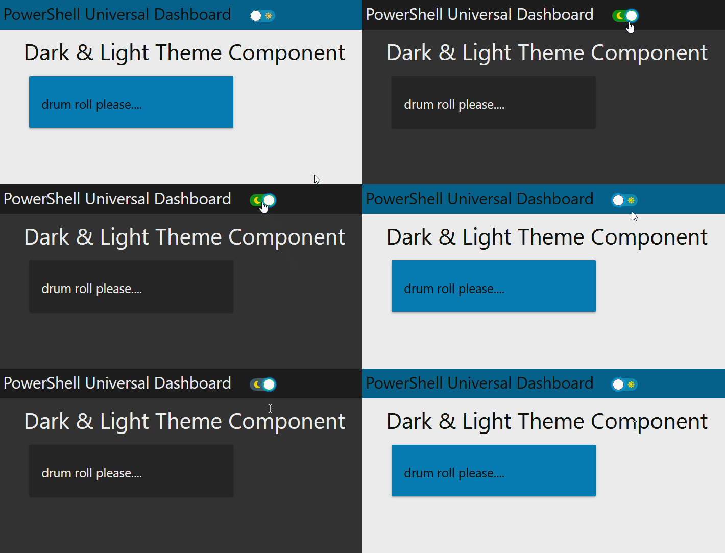
Well enough about the video course I am here today with another brand-new (well for Powershell UniversalDashboard) component which allows you to toggle between a dark theme and a light theme.
What Does This Components Do?
Again I know this particular type of component is in Powershell Universal, but for those old skool dashboarders still running on just UniversalDashboard there is nothing quite like this. I remember a fellow dashboard user on the forums had cooked up this neat idea but it wasn’t an official component. So this is a component which I have built, that has an 11kb CSS file which I constructed using the official dark theme from UD module. This allowed me with some find and replace, rebuild the hash tables back to CSS and hopefully cover all angles on all UD components.
So Why Build This Component?
As mentioned since I seen more and more websites now even including github using a toggle to flick between light and dark mode, it’s just such a cool idea, as I hate looking at my screen in the evening with a white-background, text looks better in white with a darker background in the evening for sure. I had never attempted a component like this, and all the previous ones I could find used hooks. So I thought of some simple yet effective google-fu to combat the situation and used -hook in my search. This lead me to a class component which I could finally build, and as this only exists for Powershell Universal, I thought it would be nice to being it to the original Powershell UniversalDashboard.
New-UDThemeMode
Parameters
param(
        [Parameter()]
        [string]$Id = (New-Guid).ToString(),
        [Parameter()]
        [scriptblock]$Content, #this scriptblock is used to display all of your dashboard content
        [Parameter()]
        [Switch]$DefaultDark, #switch allowing you to set darkmode as default
        [Parameter()]
        [string]$MarginTop = "-7%", #Positions this perfectly in the navbar for me
        [Parameter()]
        [string]$MarginLeft = "35%", #Positions this after dashboard title perfectly for me
        [Parameter()]
        [string]$Width = "51px", #width of the div containing the toggle
        [Parameter()]
        [string]$Height = "27px" #height of the div containing the toggle
    )
As always I try to give as many defaults as I can to my parameters so the component pretty much needs the minimal parameters supplying to it. By default you only need to define one parameter for this component which is the -Content parameter which is passed as a scriptblock and you just need to pass what-ever UD commands to display your page inside this -Content script block.
Demo
Import-Module -Name UniversalDashboard.Community -RequiredVersion 2.8.1
Import-Module -Name UniversalDashboard.UDThemeMode
Import-Module -Name UniversalDashboard.Style
Get-UDDashboard | Stop-UDDashboard
Start-UDDashboard -Port 10005 -Dashboard (
    New-UDDashboard -Content {
        New-UDThemeMode -Id "THEME_CHANGER" -DefaultDark -Content {
            New-UDHeading -Size 3 -Text "Dark & Light Theme Component"
            New-UDRow -Columns {
                New-UDColumn -size 4 -Content {
                    New-UDCard -Content { New-UDHeading -Size 5 -Text "drum roll please...." }
                }
            }

        }
    }
)

Downside
I did try but failed at allowing the end-user to decide the colour scheme used for the light and dark modes. However each time I tried to pass this as a prop in react, parameter in powershell. It just caused the component to fail to display on the page. However on the plus side…
Plus-side
If you were sensible enough to purchase my video course for £20 on building custom components then you also get the JSX file for this project, as well as the function PS1 file. With the knowledge you gain from watching my course, you will be able to rebuild this component and set your own light and dark theme colours easily.
Conclusion
I will be posting these to the powershell gallery very soon, I really enjoyed building this components and the process of complying a huge CSS file to make the light and dark theme work on all UD component objects. I really do hope this component finds it’s way to your dashboard. I will be uploading this to the powershell gallery soon, you can get your copy quicker by buying my course :-)

