4 min to read
React Flexy Table
An easy to use table with several additional features
Welcome
I just want to say a quick thank you for clicking on the link to visit this page to read about this brand-new component for Powershell Universal. I wanted to try and keep things on-a-roll as 6 days ago I finally got round to releasing my first custom component for Powershell Universal which is in my previous blog post. So without further rambling lets get blogging
Why build this component?
So a while back I was smashing out a fair-few components for Universal Dashboard, and although I still use Universal Dashboard at work, I have now upgraded to the mighty Powershell Universal which includes Universal Dashboard, but with newer frameworks, newer look, and whole bunch of new awesomeness. For more information on this product please check the vendor site After having built one custom component for Powershell Universal I wanted to build more, as the process is similar to the previous way you built custom components for UD, but is so much faster, and an easier process and binding once you figure it out. So I remember when the grids in UD offered the ability to download in Excel and that was so super-cool, I could get colleagues to download the nice grid I was providing. However it was missing the column headings of the grid. I have done a few google grids, but when I found react-flexy-table it seemed to good to be true, as you only needed to download the component dependency, and it offered a whole bunch of goodness. There is an online example here and there was enough documentation to get me going. I thought this would be another handy, or alternative component to use on your dashboards to display data.
What does this component do then?
Sadly I didn’t include all possible parameters which are mentioned for this component. Depending on the popularity I will see if I can or not. But yeah basically I was struggling to get the custom coloumn name working, which then allowed you to turn off sorting or filtering on particular columns. So maybe if someone out there is reading this and wants to help contribute to getting the columns to be defined correctly, as I couldn’t see an online example to try and match the output, that would be awesome, and make sure you name goes on the component too!
Anyways enough talking about what the component doesn’t do under the heading of what the component can do. Let’s start to reveal what this can do…
    param(
        [Parameter()]
        [string]$Id = (New-Guid).ToString(), #Allows you to specify the ID to identify component
        [Parameter(Mandatory)]
        [array]$Data, #Data is required to populate the table
         [Parameter()]
        [switch]$Filter, #Switch to filter the data by searching on a column
        [Parameter()]
        [switch]$Sort, #Switch to sort the data ascending or descending
        [Parameter()]
        [array]$PageSize = @(5,10,15,20,30,40,50), #Set custom pagination displays
        [Parameter()]
        [switch]$CaseSensitive, #Switch if you want filtering to be case-sensitive
        [Parameter()]
        [switch]$ShowExcelButton #Switch to show an Excel button to export the table to CSV
    )
Above I have listed all the parameters I included for this component and used the # comment to give a brief description on what that parameter does to the component if you use it or not.
But wait there’s more
So although I didn’t manage to include this as a parameter you can style this component to other colours than the default green. As mentioned Powershell Universal includes new tools, one of the default custom components you can to your dashboard is UniversalDashboard.Style which allows you to add custom styling to any component you display on your dashboard
New-UDStyle -Content {
New-UDComponent -Data $data -PageSize @(20,40,60,80) -Filter -Sort -CaseSensitive -ShowExcelButton
} -Style '--rft-main-color: #000; --rft-button-color: #ccc; --rft-even-row-color: #f3f3f3;'

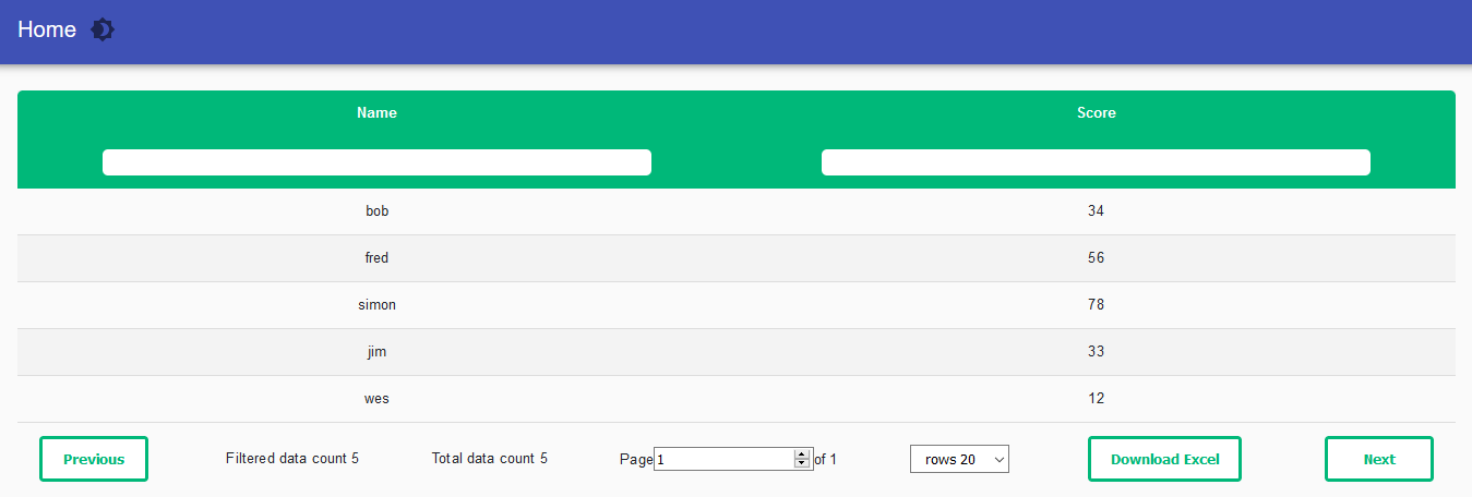
Demonstration File
I made a super simple CSV for testing purposes which contains the following:
Name,Score
bob,34
fred,56
simon,78
jim,33
wes,12
I then wanted to display this data in the flexy table component
Demo
New-UDDashboard -Title "Custom Component" -Content {
$data = import-csv C:\adam\scores.csv
New-UDComponent -Data $data -PageSize @(20,40,60,80) -Filter -Sort -CaseSensitive -ShowExcelButton
}
As you can see it is very easy to supply data to this table.
Conclusion
It was really nice to find a component with minimal dependencies, and I couldn’t believe it could do what it could do with just one dependency. As mentioned in my last blog I will look to update my course with new material on how to build custom component in Powershell Universal. I will be uploading this component to the powershell gallery very soon.