3 min to read
Speech Bubble Component
A HTML speech bubble component to alert a user about something

Welcome
Well it’s another day of living in crazy covid-19 world, and today I have no work to do which is really weird for me, since I have been in work since I was 16 years old. So today I am blogging to document this new Speech-Bubble that I have now built and got working in UniversalDashboard.
Where Did You Find It?
As with pretty much all of the components I build I found this on npmjs.com the exact link to the project can be found by clicking on this link I had talked briefly with another user on the UD forums, as they wanted to create their own toast component in UniversalDashboard, and well it got me thinking I haven’t actually done a toast component, so I found a different react component to get trying this out with.
What Parameters Does It Have?
So as I was constructing my own spin on a toasted component, I have the following parameter –Text to display the text inside the speechbubble. -TextColor which is defaulted to black but you can change this. -Title allows you to specify the text for the title of the speechbubble. -TitleColor is defaulted to black but again this sets the colour of the title within the speechbubble. -Image will display an image within the speech bubble, this can be a weblink to an image. -Link you can set the hyperlink for the object here by specifying a webaddress. -Padding defaulted to 6px but if you want more padding you can increase it here. Both the -HorizontalPosition and -VerticalPosition is to help enable you where to display the speech bubble on the screen, the default values for this are shown below.
param(
        [Parameter()]
        [string]$Id = (New-Guid).ToString(),
        [Parameter()]
        [string]$Text,
        [Parameter()]
        [string]$TextColor = "black",
        [Parameter()]
        [string]$Title,
        [Parameter()]
        [string]$TitleColor = "black",
        [Parameter()]
        [string]$Image,
        [Parameter()]
        [string]$Link = "#",
        [Parameter()]
        [string]$Padding = "6px",
        [Parameter()]
        [string]$VerticalPosition = "200px",
        [Parameter()]
        [string]$HorizontalPosition = "-200px"
    )
Example Using The Component
I’m sure any dashboard user could get this component working with ease, but it is always helpful to have an example to refer to when trying to use this for the first time.
Import-Module -Name UniversalDashboard.Community -RequiredVersion 2.8.1
Import-Module -Name UniversalDashboard.Style
Import-Module -Name UniversalDashboard.UDSpeechBubble
Get-UDDashboard | Stop-UDDashboard
Start-UDDashboard -Port 10005 -Dashboard (
    New-UDDashboard -Title "Powershell UniversalDashboard" -Content {
        New-UDSpeechBubble -Title "Powershell UniversalDashboard" -Text "Hello I am here to help and assist you in using this dashboard" -Image "https://octodex.github.com/images/daftpunktocat-thomas.gif" -VerticalPosition "80px" -HorizontalPosition "-400px"
        New-UDRow -Columns {
            New-UDColumn -Size 3 -Content {
                New-UDStyle -Style '.fa-sm {
    font-size: 6em;
	opacity: 0.2;
	float: left;
	position: absolute;
	top: 20px;
	margin-left: 145px;
}' -Content {
                    New-UDCard -Id "Services" -title "No. of Services" -Content {
                        New-UDIcon -Icon 'group'
                        New-UDHeading -Size 5 -Text "Services Running"
                        $services = (get-service | ? { $_.status -match "Running" }).count
                        New-UDHeading -Size 4 -Text $services
                    }
                }

            }
        }
    }
)
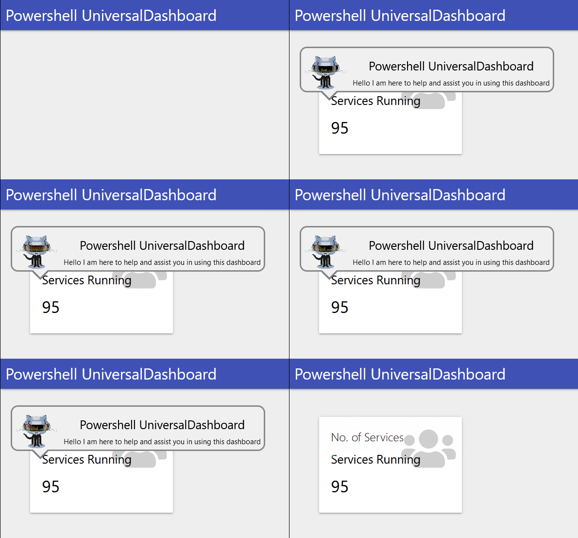
Which Gives You This

I was thinking about adding more parameters to style the speechbubble, but I figured this to me looks like a speechbubble should look. If you do want to customise the look and feel of the speechbubble further then you could you the mighty UniversalDashboard.Style which I have used to style the icon within the card to make it look a bit more fancy.
Conclusion
Thanks for taking the time to read this blog. I think there are many places you could use this component, and I really do hope it finds its way to your dashboard. Once again thanks for reading, and have a great day.

