9 min to read
Badge Component
This is a badge component which I have made into 2 components, and a third sticky navbar component

Welcome
So for me it’s another day of being on furlough. I know this sounds pretty grim and I have to admit it is not great, but at the same-time trying to stay positive and make the most of this new found time I have on my hands. So although I was thinking I must be out of components to build for UniversalDashboard I came across one I remember seeing Alon demo on the UD forums when introducing the material-ui navbar and the things you could do with it. Although I see the capability of a badge is in UD v3+ but this is locked to Powershell Universal which I am not currently using. Hence I went to build this as a custom component so it would give other dashboard users the ability to use a badge in just UniversalDashboard.
Where Did You Find It?
As with pretty much all of the components I build I found this on npmjs.com the exact link to the project can be found by clicking on this link I was literally just browsing some components, and thought damn I seen this before, and I thought it would look super sweet in UniversalDashboard. I was thinking of two main instances to use this component in a button, or in a bit of text / link. So that’s exactly what I did, and I made two components for this badge component.
What is a badge?
Yes it is something you wear on your jumper when it is your birthday, but in this case, no safety-pin is included, and you get to show this badge if it is your birthday or not. This badge component, is a small round icon that you have the chance to style the colour. And a bit like your birthday badge you may have worn when you were younger, it does display a numerical value inside the rounded icon.
So what does it actually do?
Sadly no animation with the badge component, it is purely to notify the user, this component is attached to another component, such as text or a button. I thought this would be pretty sweet if you have any exisiting endpoints in your dashboard that collect numerical values, and use them as mini notifications as a badge component within your dashboard. Either having the badge attached to a button, or a bit of text serving as a hyperlink. I also added the ability to select any of the pre-existing icons within UniversalDashboard and included this as a parameter.
What Parameters Does It Have?
So to save time, and not to re-invent the wheel, I used the exisiting Universaldashboard.UDButtonLoader which I had built previously, as this seems a pretty popular component, and attached the badge to this loading button. The badge comes defaulted to 99 being the maximum number, so any number over 99 will simply show 99+ in the badge, so if you want to increase this use the -MaxNumber parameter. The -BadgeCount is for the number you wish to be displayed within the badge. I will show a demo below but here is the complete list of parameters for the badge button module.
param(
        [Parameter()]
        [string]$Id = (New-Guid).ToString(),
        [Parameter()]
        [ValidateSet("bouncing-ball", "spinner", "jiggling-lines")]
        [string]$LoaderType,
        [Parameter()]
        [Switch]$Disabled,
        [Parameter()]
        [object]$onClick,
        [Parameter()]
        [UniversalDashboard.Models.FontAwesomeIcons]$Icon,
        [Parameter()]
        [ValidateSet('left', 'right')]
        [String]$IconAlignment = 'left',
        [Parameter()]
        [String]$BackgroundColor,
        [Parameter()]
        [string]$Text,
        [Parameter()]
        [int]$BadgeCount,
        [Parameter()]
        [string]$BadgeColor,
        [Parameter()]
        [string]$BadgeTextColor,
        [Parameter()]
        [int]$MaxNumber = 999
    )
Well I learnt some new things on this component, and used a custom .CSS file to default style the button with rounded edges, but I figured buttons may not be for everyone, so created a badge component that can be used as a text hyperlink, again with icon support. Please see the below parameter list for the badge link component
 param(
        [Parameter()]
        [string]$Id = (New-Guid).ToString(),
        [Parameter()]
        [UniversalDashboard.Models.FontAwesomeIcons]$Icon,
        [Parameter()]
        [string]$Text,
        [Parameter()]
        [string]$TextColor,
        [Parameter()]
        [string]$BadgeColor,
        [Parameter()]
        [string]$BadgeTextColor,
        [Parameter()]
        [string]$Link,
        [Parameter()]
        [string]$HoverText,
        [Parameter()]
        [int]$BadgeCount,
        [Parameter()]
        [int]$MaxNumber = 999
    )
The **-HoverText** is the Alt text shown when hovering over the hyperlink, also the **-Link** parameter will not work with external links, as I built this to work within a UniversalDashboard environment, you simply just need to specify the slash and the page name **-Link "/help"** will link you to the help page of your dashboard.
Example Using The Component
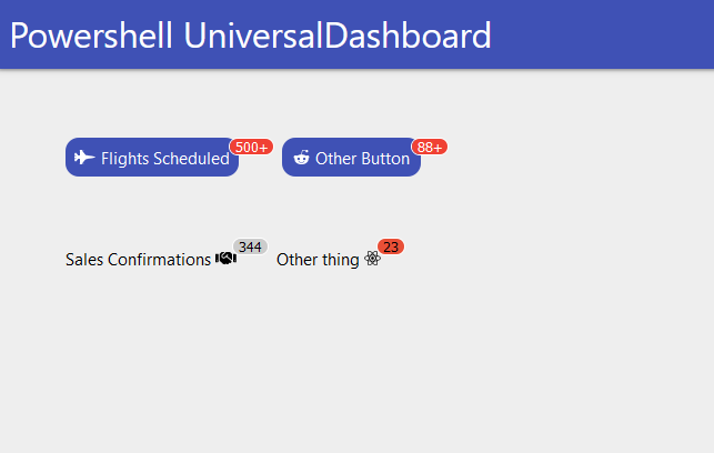
As I got older I do find it best to read the instructions, or at least skim through them. So thought it would be good to show a small demo of this component in use:-
Import-Module -Name UniversalDashboard
Import-Module -Name UniversalDashboard.UDBadgeButton
Import-Module -Name UniversalDashboard.UDBadgeLink
Get-UDDashboard | Stop-UDDashboard
Start-UDDashboard -Port 10005 -Dashboard (
    New-UDDashboard -Title "Powershell UniversalDashboard" -Content {

        New-UDRow -Columns {
            New-UDColumn -Size 4 -Content {

                New-UDBadgeButton -Text "Flights Scheduled" -BadgeCount 698 -MaxNumber 500 -Background "#3f51b5" -Icon fighter_jet -loaderType jiggling-lines -onClick {
                    Show-UDToast -Message "You clicked the button" -Duration 5000 -Position center
                    start-sleep -Seconds 5
                }
                New-UDBadgeButton -Text "Other Button" -BadgeCount 100 -MaxNumber 88 -Background "#3f51b5" -Icon reddit_alien -loaderType spinner -onClick {
                    Show-UDToast -Message "You clicked the button" -Duration 5000 -Position center
                    start-sleep -Seconds 5
                }
                New-UDRow
                New-UDRow
                New-UDRow
                New-UDBadgeLink -Text "Sales Confirmations" -TextColor "#000" -Link "help" -HoverText "Check this link out" -BadgeColor "#ccc" -BadgeTextColor "#000" -BadgeCount 344 -Icon handshake -MaxNumber 400

                New-UDBadgeLink -Text "Other thing" -TextColor "#000" -Link "help" -HoverText "Wow look at this" -BadgeColor "#E94F37" -BadgeTextColor "#000" -BadgeCount 23 -Icon react -MaxNumber 400
            }
        }
    }
)
Which Gives You This
But wait there’s more…
So as mentioned I saw this a while back which Alon kindly posted a screenshot of on the UD forum. Showing the capabilities of Material-UI navbar and ultimately I wanted to replicate that look and feel as I thought it looked super-sweet. Well in my head I was half-way there already, all I needed was some way of implementing that into the Materialize navbar. Well I literally spent a day looking at various navbar components in react and trying to implement this into UniversalDashboard, and well it didn’t go to well. I then stumbled on this component which with a bit of HTML allowed me to create another navbar and overlay this ontop of the exisiting navbar, and allow the capability of positioning this additional navbar so not to block off the exisiting title, or signout link you may have.
StickyNavbar
So another component was created, and I was super happy with the final outcome of this. So I mean I have a really small laptop screen, and if anyone out there wants to help out a brother in need I will gladly accept a new laptop, one that has an solid state drive would certainly boost things for me. Anyways, as mentioned I got a small laptop viewing area, so you will most likely have to play with the parameters to get it to match your screen.
Please note the one big gotcha with this component is I had to set the main content of the page to a negative number for the top, for the navbar to display ontop of the original navbar and not underneath the exisiting navbar. As for me screen-space means everything. So to fix this issue, you may need to implement a few New-UDRow before any dashboard content so that this all displays correctly.
What parameters does this sticky component have?
 param(
        [Parameter()]
        [string]$Id = (New-Guid).ToString(),
        [Parameter()]
        [scriptblock]$Content,
        [Parameter()]
        [string]$Width = "100%",
        [Parameter()]
        [string]$Height = "36px",
        [Parameter()]
        [string]$BackgroundColor = "#3f51b5",
        [Parameter()]
        [string]$Color = "#fff",
        [Parameter()]
        [int]$Top = "-22",
        [Parameter()]
        [int]$BottomBoundary = "1200",
        [Parameter()]
        [string]$MarginTop,
        [Parameter()]
        [string]$PaddingBottom = "0px",
        [Parameter()]
        [string]$PaddingTop = "12px",
        [Parameter()]
        [string]$PaddingLeft = "0px",
        [Parameter()]
        [string]$PaddingRight = "0px",
        [Parameter()]
        [string]$BorderRadius = "0px",
        [Parameter()]
        [string]$LeftIndent = "40%",
        [Parameter()]
        [string]$RightIndent = "25%"
    )
Demo
For demonstration purposes I knocked together a real simple dashboard that will now feature a sticky navbar, for me this is great, as I have lost count for the amount of times I have had to explain the hamburger menu is a menu to some people. So figure if the links to the pages are in a nice simple consistant place then it will be easier for my end-users to navigate around the dashboard
Import-Module -Name UniversalDashboard
Import-Module -Name UniversalDashboard.UDStickyNavbar
Import-Module -Name UniversalDashboard.UDBadgeButton
Import-Module -Name UniversalDashboard.UDBadgeLink

Get-UDDashboard | Stop-UDDashboard
Start-UDDashboard -Port 10005 -Dashboard (
    New-UDDashboard -Title "Powershell UniversalDashboard" -Content {

        New-UDStickyNavbar -id "ADZNAVBAR" -LeftIndent "33%" -PaddingLeft 12px -Top -1 -Height 36px -Content {
            New-UDBadgeLink -Id "SalesConfirm" -Text "Sales Confirmations" -TextColor "#fff" -Link "Sales" -HoverText "Sales Confirmations" -BadgeColor "#800E13" -BadgeTextColor "#fff" -BadgeCount 344 -Icon handshake -MaxNumber 400
            New-UDBadgeLink -Id "DealConfirm" -Text "Deal Confirmations" -TextColor "#fff" -Link "Deals" -HoverText "Deal Confirmations" -BadgeColor "#1985A1" -BadgeTextColor "#fff" -BadgeCount 34 -Icon address_card_o -MaxNumber 100
            New-UDBadgeLink -Id "DealsDone" -Text "Deals Closed" -TextColor "#fff" -Link "Completed" -HoverText "Deals Closed" -BadgeColor "#B67702" -BadgeTextColor "#fff" -BadgeCount 3 -Icon file_excel -MaxNumber 100
        }
        New-UDRow
        New-UDRow
        New-UDRow
        New-UDRow
        New-UDRow
        New-UDRow
        New-UDHeading -size 6 -Text "Some random text"
        New-UDRow
        New-UDHeading -size 6 -Text "Some random text"
        New-UDRow
        New-UDRow
        New-UDHeading -size 6 -Text "Some More random text"
        New-UDRow
        New-UDHeading -size 6 -Text "Some More random text"
        New-UDRow
        New-UDRow
        New-UDRow
        New-UDHeading -size 6 -Text "Some More random text"
        New-UDRow
        New-UDRow
        New-UDHeading -size 6 -Text "Even More random text"
        New-UDRow
        New-UDRow
        New-UDRow
        New-UDRow
        New-UDHeading -size 6 -Text "Even More random text"
        New-UDRow
        New-UDRow
        New-UDRow
        New-UDHeading -size 6 -Text "Even More random text"
        New-UDRow
        New-UDRow
        New-UDRow
        New-UDRow
        New-UDRow
        New-UDRow
        New-UDRow
        New-UDRow
        New-UDRow
        New-UDRow
        New-UDRow
        New-UDRow
        New-UDRow
        New-UDRow
        New-UDRow
        New-UDRow
        New-UDRow
        New-UDRow
        New-UDHeading -size 6 -Text "Yep it's Even More random text"
        New-UDRow
        New-UDRow
        New-UDRow
        New-UDRow
        New-UDRow
        New-UDRow
        New-UDRow
        New-UDRow
        New-UDRow
        New-UDRow
        New-UDRow
        New-UDRow
        New-UDRow
        New-UDRow
        New-UDRow
        New-UDRow
        New-UDHeading -size 6 -Text "The end"
    }
)
Which gives this

Conclusion
A bit of a longer blog than I planned, but then again it took me a longer time than expected to figure a decent way to build in additional stuff into the exisiting navbar, and essentially added a new navbar. I hope these components find there way to your dashboard, as for me this will make the navigation more simple for my end-users, and allow me to bring there attention to text or buttons, where they need to click it to take action. I hope you have a great day and thanks for taking the time to read this blog.


