6 min to read
ScrollSpy Navigation Component
A new component great for a navigating a long page

Welcome
So I didn’t think I would be back blogging. Especially as today is officially my first day of holiday. But well I just couldn’t help myself when I saw this component. It has been one that has been around for years, but just for what-ever-reasons has never made it to the marketplace. Like just why hasn’t something like this been implemented or requested? I really don’t know, but now I know any long dashboard pages I have I will be adding this cool new custom component to it. So what the heck am I waffling on about, well it’s my new custom component that I have built this evening whilst looking for another component. Please remember you to can also build cool looking custom components like this one, by buying my course on how to create custom components here

What Does This Components Do?
Well it won’t make your personal life any better, but it will make navigating a long dashboard page a lot better. It will automatically scroll to the given part of the page. So on a really long page, like maybe the company policy page you have (or don’t) and you want people to be able to easily navigate to certain parts of the page. Well how can you do that? Well you cannot unless you use this component, which will come in to save the day
So Why Build This Component?
Well I been building components for a while now, and well I want to use the hook method Alon kindly shared when I was struggling to build the star rating New-UDFeedback and Alon shared a template on github. I used this the other day and was a lot easier than I remembered it being, so anyways I then stumbled across this component which doesn’t use hooks, and well the rest is history as they say. Again it’s something I seen for ages on websites and is nothing new, and life-changing, but for some-reason this type of scrolling navigation to the exact location on the page does not exist to my knowledge, and that was a good enough reason for me to build this component.
New-UDScrollSpy
Parameters
 param(
        [Parameter()]
        [string]$Id = (New-Guid).ToString(),
        [Parameter()]
        [string]$BackgroundColor = "#3f51b5", #Backgroundcolour for the scrollspy navbar
        [Parameter()]
        [string]$FontColor = "#ffffff", #Font colour to be displayed on the scrollspy navbar
        [Parameter()]
        [int]$MarginTop = -50, #How far down the page you want the navbar to be visible
        [Parameter()]
        [int]$MarginLeft = -50, #How far to pull the navbar over to the left
        [Parameter()]
        [int]$Offset = 50, #When scrolling to element on the page this is the offset
        [Parameter()]
        [int]$ScollDuration = 800, #How slow or fast to make the scroll animation
        [Parameter()]
        [array]$ScrollTargetIds,#You need to give the components IDs then specify an array of IDs
        [Parameter()]
        [scriptblock]$Links,#See the demo on how to specify the links to be shown in navbar
        [Parameter()]
        [int]$Height = 30 #Height of the navbar
 )
As always I try to give as many defaults as I can to my parameters so the component pretty much needs the minimal parameters supplying to it. Which in this case would be the following paramters SCROLLTARGETIDS,LINKS both need specifying to make this component work as desired.
Demo
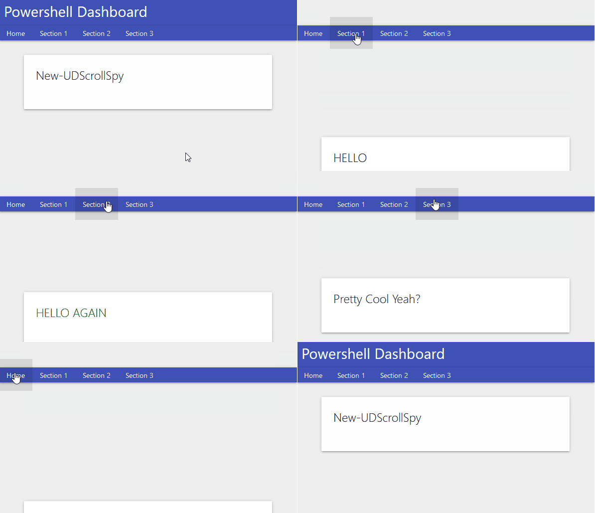
So for the exact demo of the GIF I will be using the following code:-
Import-Module UniversalDashboard.Community -RequiredVersion 2.8.1
Import-Module "C:\UD\ScrollSpy\UDScrollSpy\src\output\UniversalDashboard.UDScrollSpy\UniversalDashboard.UDScrollSpy.psd1"
Get-UDDashboard | Stop-UDDashboard
$dashboard = New-UDDashboard -Title "Powershell Dashboard" -Content {
    New-UDScrollSpy -Id "SCROLLSPY" -Offset -50 -MarginTop -66 -ScrollTargetIds @("home", "section_1", "section_2", "section_3") -Links { New-UDElement -Tag li -Content { New-UDLink -Text "Home" -Url "#home" }; New-UDElement -Tag li -Content { New-UDLink -Text "Section 1" -Url "#section_1" }; New-UDElement -Tag li -Content { New-UDLink -Text "Section 2" -Url "#section_2" } ; New-UDElement -Tag li -Content { New-UDLink -Text "Section 3" -Url "#section_3" } }
    New-UDRow -Columns {
        New-UDColumn -size 12
        New-UDCard -id "home" -Title "New-UDScrollSpy"
        New-UDRow
        New-UDRow
        New-UDRow
        New-UDRow
        New-UDRow
        New-UDRow
        New-UDRow
        New-UDRow
        New-UDCard -Id "section_1" -Title "HELLO"
        New-UDRow
        New-UDRow
        New-UDRow
        New-UDRow
        New-UDRow
        New-UDRow
        New-UDRow
        New-UDRow
        New-UDCard -Id "section_2" -Title "HELLO AGAIN"
        New-UDRow
        New-UDRow
        New-UDRow
        New-UDRow
        New-UDRow
        New-UDRow
        New-UDRow
        New-UDRow
        New-UDRow
        New-UDRow
        New-UDCard -id "section_3" -Title "Pretty Cool Yeah?"
        New-UDRow
        New-UDRow
        New-UDRow
        New-UDRow
        New-UDRow
        New-UDRow
        New-UDRow
        New-UDRow
    }
}
Start-UDDashboard -Dashboard $dashboard -Port 10005
Yes I know there is loads of New-UDRow, but just imagine that is actual text content, or vertical content on your page. Please note how to specify the links
-Links {
 New-UDElement -Tag li -Content { New-UDLink -Text "Home" -Url "#home" };
 New-UDElement -Tag li -Content { New-UDLink -Text "Section 1" -Url "#section_1" }; New-UDElement -Tag li -Content { New-UDLink -Text "Section 2" -Url "#section_2" } ; New-UDElement -Tag li -Content { New-UDLink -Text "Section 3" -Url "#section_3" }
 }
Well this is the best solution I could come up with in the time I took to build this component, it works, and gives the desired results. So I stopped looking for a different method once it ticked all the boxes.

Added a few more parameters
Althogh I was happy with this component, the spacing between the top of the screen and the component didn’t quite sit right. Yes I like to make things as perfect as possible, or try to…so I added the following parameters
  [Parameter()]
        [int]$Top = 60, #How far down the scroll navbar appears
        [Parameter()]
        [int]$zIndex = 20, #Position behind UDnavbar
        [Parameter()]
        [string]$Width = "100%" #Width of the scollspy navbar
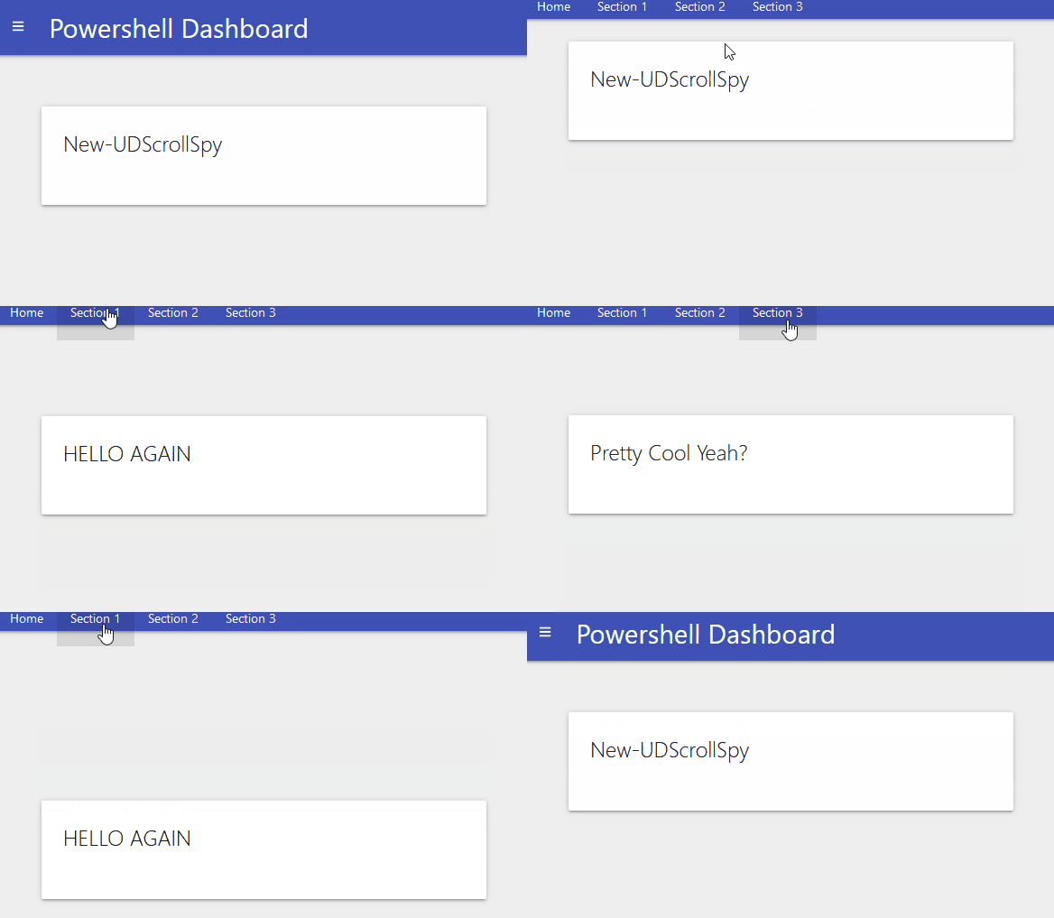
Again to try and be helpful I am giving default values on these new parameters to make life a bit more simple for you. So re-runnning the demo code should now produce the following

this for me looks a lot better than the above GIF from the demo code. Now using this same demo code but with the new parameters added will now sit the scrollspy navbar nicely behind the UD navbar and stays positioned right at the top of the screen, without leaving any space like before.
Conclusion
Although I have seen this effect on many different websites over the years, I just never actually bothered searching for this component to build. As mentioned I kind of found this one by mistake, but thought it looked to good to pass up the chance to try and make it work in UD. I am glad I stuck with the component as it did take a few builds to figure out how to specify the links in the component. I hope this component finds its way to your dashboard, I will certainly be implementing this in the long dashboard pages I have. Not sure why this particular component didn’t already get built by me? Well it has now. I will be uploading this to the Powershell gallery real soon, if I do not blog again before Christmas, have a great one.

