3 min to read
Simple Drawer Component
Simple drawer notification modal for users

Welcome
Back with another blog. Yep I am still on holiday but to help keep my brain functioning with all the excitment of a teir 4 Christmas lockdown where I live, meaning I basically cannot even leave my house other than for exercise. I have got another component to blog about that I built the other day. Please remember you to can also build cool looking custom components like this one, by buying my course on how to create custom components here
What Does This Components Do?
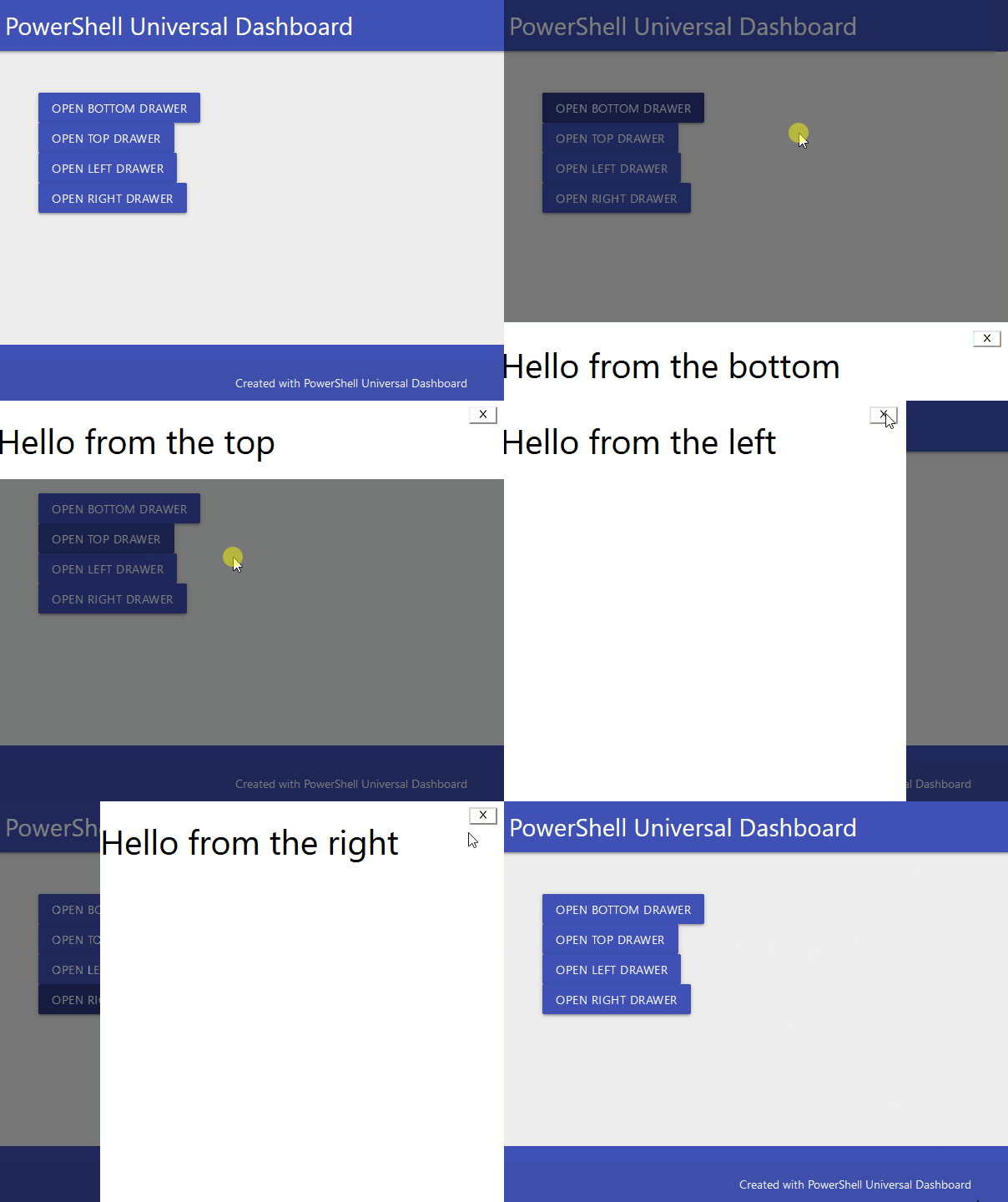
Basically it is a modal, but different to maybe the modal you are used to seeing, I believe there is already a drawer component in Powershell Universal, but not one in UniversalDashboard. I only found this out after building the component, and thinking I cannot release a same named component as one that has been officially released, to save on confusion. So this simple drawer component can bring the user attention to focus on the component, by bring this component in from the bottom, top, left or right direction

New-UDSimpleDrawer
Parameters
  param(
        [Parameter()]
        [string]$Id = (New-Guid).ToString(), #Id to identify the component
        [Parameter()]
        [ValidateSet("top", "bottom", "left", "right")]
        [string]$Placement = "right", #Placement of the simple drawer
        [Parameter()]
        [string]$Class = "btn", #Class to identify the component
        [Parameter()]
        [string]$ButtonText, #Text to be displayed on button which opens simple drawer
        [Parameter()]
        [bool]$Overlay = $true, #Adds the shaded effect to the part of the screen not showing the drawer
        [Parameter()]
        [bool]$Open = $false, #Boolean value to decide if the drawer should be open or closed
        [Parameter()]
        [bool]$CloseIcon = $true, #Shows a close icon on the simple drawer
        [Parameter()]
        [bool]$CloseOnEscape = $true, #Allows you to close the drawer pressing the escape key
        [Parameter()]
        [bool]$CloseOnMask = $true, #Closes the simple drawer when clicking on the overlay area
        [Parameter()]
        [scriptblock]$Content #Adds the content to the simple drawer
    )
As always I try to give as many defaults as I can to my parameters so the component pretty much needs the minimal parameters supplying to it. Which in this case would be the following paramters BUTTONTEXT,CONTENT both need specifying to make this component work as desired.
Demo
So for the exact demo of the GIF I will be using the following code:-
Import-Module -Name UniversalDashboard
Import-Module -Name UniversalDashboard.UDSimpleDrawer
Get-UDDashboard | Stop-UDDashboard
Start-UDDashboard -Port 10005 -Name "Powershell Dashboard" -Dashboard (
    New-UDDashboard -Content {
        New-UDSimpleDrawer -id "DRAWER" -ButtonText "Open Bottom Drawer" -Class "btn" -Placement "bottom" -Content { New-UDHeading -size 3 -Text "Hello from the bottom" }
        New-UDSimpleDrawer -id "DRAWER" -ButtonText "Open Top Drawer" -Class "btn" -Placement "top" -Content { New-UDHeading -size 3 -Text "Hello from the top" }
        New-UDSimpleDrawer -id "DRAWER" -ButtonText "Open Left Drawer" -Class "btn" -Placement "left" -Content { New-UDHeading -size 3 -Text "Hello from the left" }
        New-UDSimpleDrawer -id "DRAWER" -ButtonText "Open Right Drawer" -Class "btn" -Placement "right" -Content { New-UDHeading -size 3 -Text "Hello from the right" }
    }
)

Changing the width or height
Sadly I didn’t see either width or height as an availble prop to the component. However if you did want to adjust eith of these you can easily do this via CSS. Just right click on the open simple drawer you wish to change, then find class="drawer-content" and you will then see the CSS code you can copy, either add to your theme, or use UDHelmet to customise the CSS of this particular component when you use it.
Conclusion
Ok this might not be the coolest or best component I have released so far, but I do still think it was worthy of releasing, as I could see this being handy to bring the user attention to a specific part of the page, or a message you need them alerted to, then having the ability to force the user to have to click the close icon in the corner to close it, or allow them to close it via the escape key, there is enough options to make this work for you. I will be uploading this to the Powershell gallery real soon, if I do not blog again before Christmas, have a great one.

