10 min to read
Google Charts For UniversalDashboard
An amazing team-up between 2 nations happened to bring you 4 brand-new components, all chart components for UniversalDashboard.

Welcome
As I started off with my last blog…It has been a while since my last blog. Wow nearly mostly through the second month of 2020 and I been really busy, hence this delay in blogging. Having a tough time with life at the moment, so thought the solution was to literally just work all the time and then hopefully get paid for all the over-time I put in for work…sadly that bit of optimism I actually had was crushed like an ant being stepped on. But as they say always try and look on the bright side of life, and in the development of these Google Chart components I was blessed to have a brand new crime-fighting partner aka Augustin Ziegler. Now I without showing my age there is a decade between us. So was quite in awe when Augustin busted out the powershell moves to solve the puzzle, and also keep crime at an all time low.
It started with a Tree
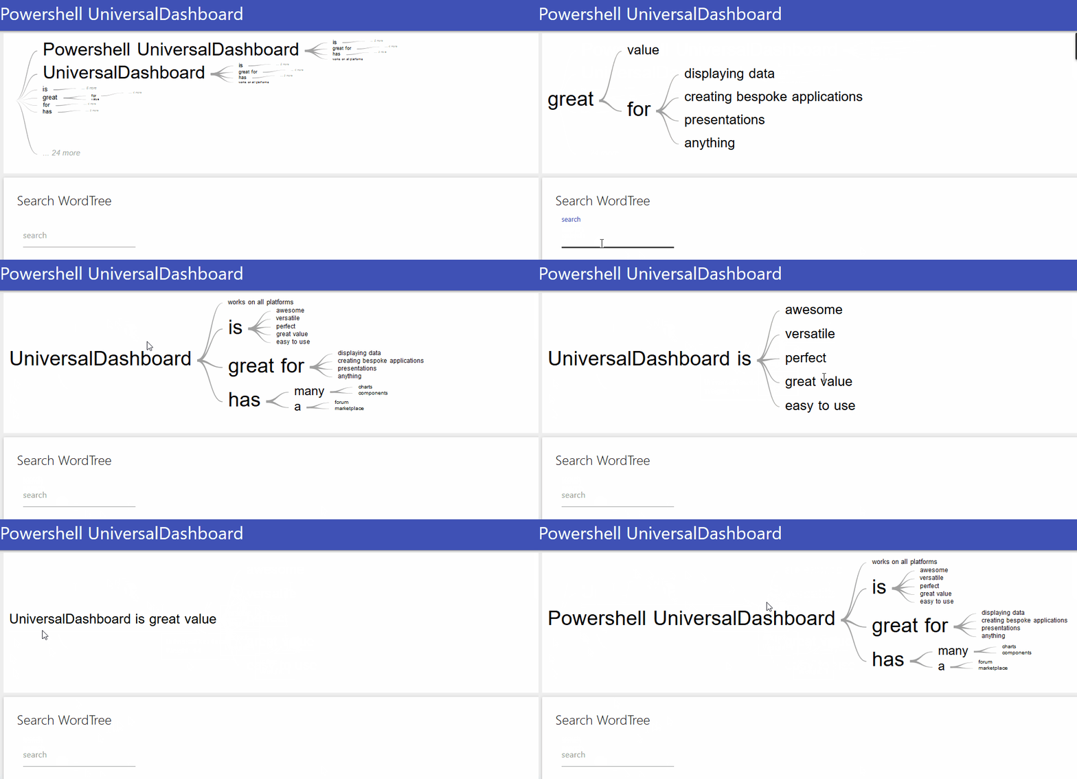
So this whole adventure began with me stumbling upon the google chart page. I was like wow, some of these charts look amaze-balls. The one that really caught me eye was the WordTree chart. As I work for a company distributing drink and food, I always get asked to produce information on which customer bought what products. Putting this information into a grid can end up producing a lot of results, and either mean a lot of clicking or filtering, or even exporting to Excel. So I was thinking in my head I could write an SQL query concat the results into a sentence, then display this in a WordTree Chart. Easy right? I mean I was thinking I could place all results into one chart that would fit on the page.
I managed to build this component but I couldn’t somehow place the contents of the file into a WordTree chart, I could only get it working by manually typing the sentences into the script…I got to the head-banging against a wall stage as was not making any progress with reading the data from a file, or variable…so the place to go when you have a problem or question with UniversalDashboard the forum is the place to head to. So I posted my problem and asked for help. now this is the amazing thing with the Internet and open-source software is that is brings people together, and you can even team-up with people from different nations with different ideas, and different approaches. Augustin came up with the goods at stupid oclock his time, and I was like WTF the next day in the office as he told me how long it took him, and I knew how long I had looked at it. Either way I was chuffed as nuts to finally have this being able to read from a file or variable and display the contents. I used over 275,000+ rows from SQL output and it all rendered without issues, and no delay using this as a WordTree Chart locally. However I did find using this across the network wasn’t that practical due to the size of the file. Still was interesting to see how much data I could realistically chuck at this component. Get your copy of WordTree here
Favour for a favour
I like to think like you probably think, that you are a decent human being and life is not just about taking but also giving. So when Augustin asked if I could repay the favour by doing another super hero team-up to save the world for a second time I was like damn yeah lets go fight some bad guys. Although there were no actual bad guys to fight, and the world didn’t really need saving,I was able to use some of the super-sweet techniques Augustin had done on the WordTree to make this work. However he had to go show me that he didn’t need any mentoring in the Powershell department and once again showed an ageing crime-fighter that this new side-kick had some super neat skills to display. Then boom the Google TimeLine Chart component for UniversalDashboard

Gantt it up
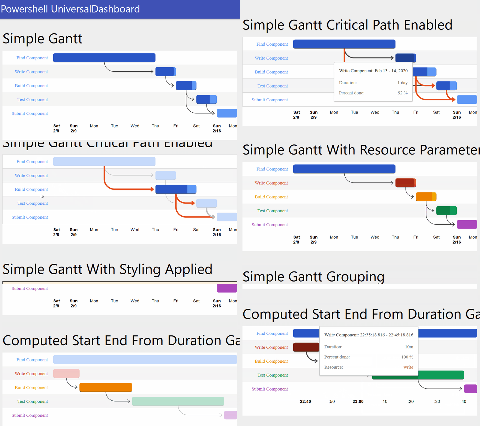
So whilst working on the TimeLine component I came across the Gannt Chart which I personally preferred as it seemed to offer more flexibility and was also time related. So thought I should try and put this together…but I swear some kryptonite is in my local water as felt my react skills were fading me, and was struggling to make this more powershelly if thats even a word. So once again boy wonder aka Augustin stepped in beat up all the bad guys and showed me a few new moves in the art of powershelling someone with a good right hand, and put another super solution in place to pass the data in a pure-powershell way to the component. The Gantt Chart is here on the marketplace
Google Gauge Chart
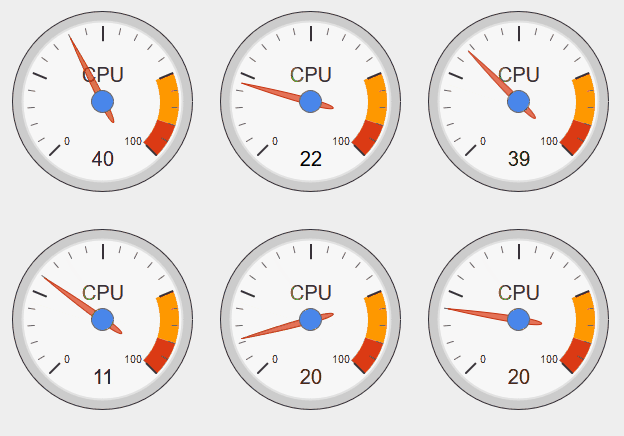
The gauge chart that I put on the marketplace proved to be my most popular component. That was before it got re-vamped with the D3 library when someone requested this on the forum. Again on the forum someone mentioned monitoring remote computers, and although I have done this I thought that this Google Gauge Chart would be the perfect solution to that problem giving nice clear easy-to-understand display and the fact it doesn’t take up any real space on the dashboard page. With all the new tricks I learnt off of my new side-kick I thought I better show that I can still pull of some components on my own. But in reality I used the same method Augustin had used, and just tweeked this to my needs. Get the Google Gauge Chart here
Where’s all the code dude?
Hmm good question…no only joking so I tried to clever and add a half decent readme to these new components, all of which you will find on the marketplace, as that pulls the readme from the project site. All my projects you can find here on my github page
New-GoogleBarChart
Well I did it again and broke some naming convention for this component, without stating the UD bit infront of the control. Again I was thinking you got a barchart in UD but I have seen quite a few people request a horizontal bar chart. As it happens the Google Barchart is horizontal by default. The other cool thing about the Google Barchart is that is only take a boolean value to change it to a stacked graph. So it is like two components in one. What makes this even more cool, is that the Google ColumnChart has the exact same props as the barchart apart from the chart name. So this then allowed me to use the parameter, with two defined values in it, two let you make a horizonatal barchart or a vertical barchart aka a Columnchart. So then as I could now produce a columnchart and a barchart (in my opinion they are the same thing apart from layout) this then gave me a total of 4 different looking charts from one originally designed component.
Parameters
There are quite a few parameters to use, so please read this section to make the best use of the chart:-
-ChartType This allows a selection of Barchart (horizontal) or Columnchart (vertical) to decide the layout, defaults to Barchart
-Data Is again a multi dimension array of two or more. Please see the demo for usage, again you have to give a title to the array
-Width String parameter to set the width of the component this is defaulted to “500px”
-Height String parameter to set the height of the component this is defaulted to “500px”
-Title String value to give your chart a title along the top
-ChartArea String value defaulted to “50%” no need to adjust, only if you want the chart taking up more area space
-Stacked Is a boolean value which is defaulted to $false so if you want to display a stacked chart make sure you pass $true
-BottomTitle String value to set the title at the bottom of the chart
-StartingValue Integer which is defaulted to 0 but if you needed a different start value to display the chart then change this
-VerticalTitle String value to set the title going vertically along the chart
Version 1.0.1 Added Parameters
- -Animation Allows you to select the animation from a validateset
- -AnimationDuration Integer value defaulted to 2000 controls the animation duration
- -LegendFontColor String value to set the legend font colour
- -LegendFontSize Integer to set the font size of the legend text
- -LegendPosition A validateset to allow you to position the legend
- -TitleFontSize Integer value to set the title font size
- -TitleFontColor String value to set the title font colour
- -BackgroundColor Sets the background colour of the chart via a string
Version 1.0.2 Added Parameter
- -Colors Allows you to specify an array of colours to set for your barcharts
Demo
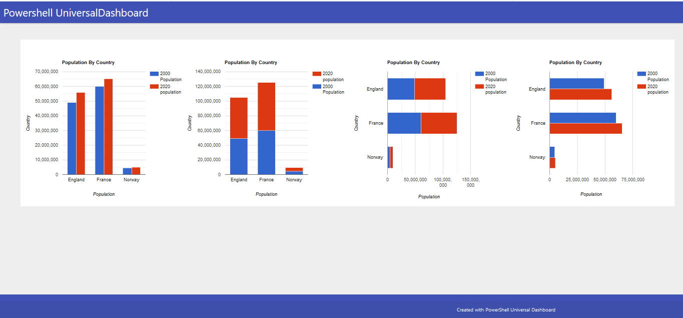
Here is a dashboard showing the same chart data but in 4 different styles:-
Import-Module -Name UniversalDashboard
Import-Module -Name UniversalDashboard.GoogleBarChart
Get-UDDashboard | Stop-UDDashboard
Start-UDDashboard -Port 10005 -Dashboard (
    New-UDDashboard -Title "Powershell UniversalDashboard" -Content {
        $MultiArray = @()
        $MultiArray += , @('Country', '2000 Population', '2020 population' )
        $MultiArray += , @('England', 49023000, 55977178)
        $MultiArray += , @('France', 60051000, 65273511)
        $MultiArray += , @('Norway', 4499367, 5036800)
        New-UDLayout -Columns 4 -Content {
            New-GoogleBarChart -ChartType "ColumnChart" -data @($MultiArray) -Width "500px" -Height "500px" -Title "Population By Country" -BottomTitle "Population" -VerticalTitle "Country"
            New-GoogleBarChart -ChartType "ColumnChart" -data @($MultiArray) -Width "500px" -Height "500px" -Title "Population By Country" -BottomTitle "Population" -VerticalTitle "Country" -Stacked $true -Colors @("#D6BA73", "#8BBF9F")
            New-GoogleBarChart -ChartType "BarChart" -data @($MultiArray) -Width "500px" -Height "500px" -Title "Population By Country" -BottomTitle "Population" -VerticalTitle "Country" -Stacked $true
            New-GoogleBarChart -ChartType "BarChart" -data @($MultiArray) -Width "500px" -Height "500px" -Title "Population By Country" -BottomTitle "Population" -VerticalTitle "Country"  -Colors @("#04080F", "#507DBC")
        }
    }
)
Which as long as you have internet connection as that is required for these charts, you should get the following:-
Show Some Respect
If you are just using universaldashboard.community version think about putting your hand in your wallet/purse and purchase the enterprise edition. I personally own 2 licenses for this, as I think the software is extremely well priced and I know that by buying the product I am helping the developer carry on making the product even better. So please show some respect and go buy your copy of Enterprise edition. I can certainly vouch it is well worth the money and I have been able to produce my company high-end looking dashboards using just my powershell skills, to display the desired information.
Conclusion
These were super-cool components to release, and felt extra good to be able to team-up, learn some new tricks, and along the way bring some brand-new charts to the world of UniversalDashboard. Thanks for taking the time to read this blog any questions on using these specific components please post the issue on the related github page. Peace.
