6 min to read
Using CSS to Style
A blog to show how to style components or parts of your dashboard, that may not have a built in parameter for the colour.

Welcome
Wow what a crazy year 2020 has been! I not been blogging for numerous reasons, and the pandemic not being one of those reasons, but feel if I get typing all the reasons out, it will divert the whole reason I do blog.
So if this is the first blog of mine you are reading, welcome and hopefully it’s going ok for you as it is for me. Welcome to my blog site.
What is this blog about?
So this blog is going to cover CSS, which as you may or may not know stands for cascading style sheet and is what is used in the background of web-pages to style the web-page, colour specific items/component in a specific manner, so you as the designer do not have to hard code your colour for each item on your page as you can just get the CSS to do it. So in essance I see it as the template for how your site will look and feel colour, font and style wise.
Why am I writing this blog then?
So it’s been a long while since I wrote a blog, and well I got asked on the universaldashboard forum from a few different users on how to go about styling some different components using CSS. I thought instead of me using the same techinique I am about to share in this blog, and answer the questions, why don’t I just write a blog to explain how I do it. Ok so I am not a web developer by trade, and in the grand scheme of things, I do not consider myself an expert in CSS. However I am more than happy to share how I figured all this CSS malarky out, and hopefully this will show you the light in figuring CSS out for your universaldashboard page you are working on, or inspire you to create your own theme for universaldashboard.
Lets get going then…
There is no right or wrong when it comes to what browser you use to surf the internet, but for whatever reasons I use Firefox as my browser of choice to surf the net, and do all my CSS in. The great thing with CSS is you can edit it on-the-fly so you see changes in real time, the only down-side is when the page refreshes, you loose the changes you make.
So before I actually start making all my awesome GIFs for this blog make sure you bookmark this site for CSS colours it gives you amazing colours that all blend really nicely together, and it is where I go to get my inspirations for the colour layout of my CSS theme I cook up.
Follow these steps
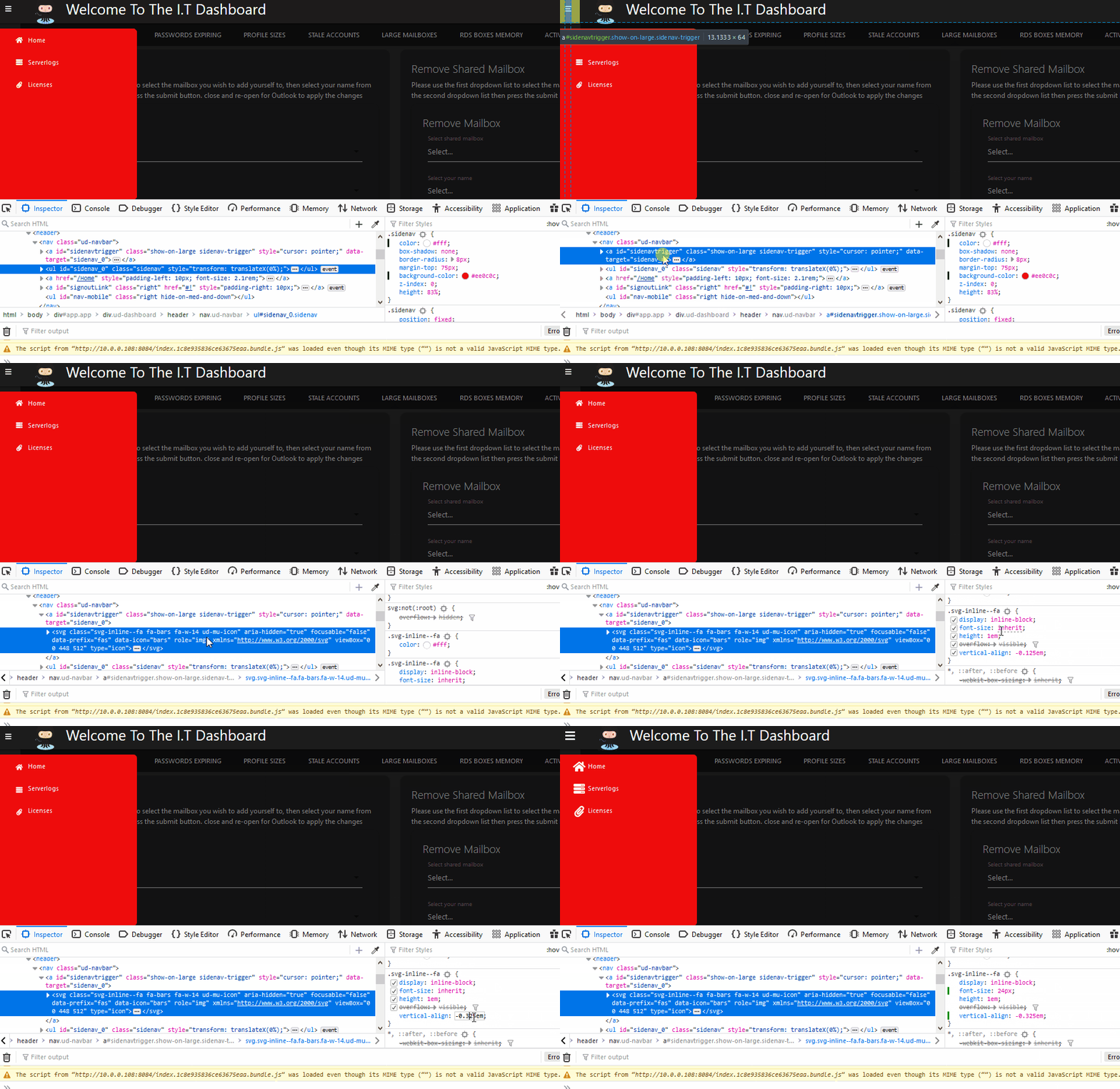
So I recorded a little GIF to go with this, so basically say you want to change the SIDE NAV colour but you don’t have a scooby-doo on how to do this…so step 1 is to right click on the ‘thing’ you are interested in changing then left clicking on inspect element. This will then open up the CSS used in the page. Now if you move your mouse about you will see it highlights the bits of the page that those secitions of the code on the left hand side refer to. So after hovering the mouse about I see I need the line which has already been highlighted the ul id="sidenav" so with this selected, you will see I move to the right side, which shows me all the CSS properties to play with. I scroll down to where I see the colour, and I select a different colour, I see real-time the part of the page it is changing and if this is or isn’t the thing I want changed. Once I am happy with the changes I copy the rule by right clicking on it and slecting copy rule. This is crucial for the next stage.

So if you copied the rule, and then paste this into either your code editor or notepad you should have something similar to:-
.sidenav {
	color: #fff;
	box-shadow: none;
	border-radius: 8px;
	margin-top: 75px;
	background-color: #ea0e0e;
	z-index: 0;
	height: 83%;
}
You can see there are 7 different things you could change on this, but we only changed the colour, so we can trim this down to:-
New-UDTheme -Name "Basic" -Definition @{
'.sidenav' =@{
'background-color' = "#ea0e0e"
}
But what if I also want to make the hamburger menu a tad bigger…? No problem! Simply repeat the process, in the GIF below, I am using the method of just scrolling the mouse about on the code on the left to see the parts of the page being highlighted. Once I see the hamburger menu being highlighted I stop, click on the code, I see it can be expanded further, so I expand it, then I go to the right hand side to look at all the CSS properties. I notice a vertical alignment, and a font size which both look interesting things to change. Remember once you make the change and you think it looks cool copy the rule and paste it somewhere:-
.svg-inline--fa {
	display: inline-block;
	font-size: 24px;
	height: 1em;
	overflow: visible;
	vertical-align: -0.325em;
}

So now you should have a mini theme of your own in the building like so:-
New-UDTheme -Name "Basic" -Definition @{
'.sidenav' =@{
'background-color' = "#ea0e0e"
}
'.svg-inline--fa' =@{
	'font-size' = "24px"
	'vertical-align' = "-0.325em"
}
We have now modified a few bits of universaldashboard and put them into a custom theme. Then you can add the custom theme you build to your dashboard using this link I hope this gives you the building blocks you need to get going yourself.
Final Notes
So there is a few more things to mention without giving you a brain over-load. One of them being is the !important tag you can use after specifiying the attribute you want to change. Basically this tag over-rides any settings that might already be in-place. So use this with caution, and only use it if you have to. Lastly, without making things to confusing, but the browser might not actually show you all the properties, but don’t worry, if you click just underneath a setting in he browser, you get to add another CSS style. So for example, the side nav menu using the “default” theme gives a different background colour on the navigation links, which is the '.sidenav li > a' bit of code, inspecting it in the browser, shows no background-color CSS setting, so I created it to overcome the issue, however this didn’t seem to apply unless I used the !important at the end of the CSS setting as shown below
$Theme = New-UDTheme -Name "Test" -Definition @{
    '.sidenav'        = @{
        'background-color' = "#0d3b66"
    }
    '.sidenav li > a' = @{
        'color' = "white"
        'background-color' = "#0d3b66 !important"
    }
} -Parent "default"
Conclusion
Only after doing this, I thought DOH! I did CSS as my first post. Well hopefully this was a slightly different way of explaining it and how to go about implementing your own theme, and using it with existing themes.

