9 min to read
Page Loading Components
Two different page loading components for your dashboard
Welcome
First off I hope everyone reading this blog had a wonderful Christmas given the circumstances. Sadly where I live in England they put it into a new tier 4 category just before Christmas, and basically the new restrictions the government made up was stay-at-home and do-not-see-family. So been an extra weird Christmas this year not seeing friends and family. Thankfully I have been blessed with 4 daughters so my house is always busy and lively, so I hope my daughters still had a good Christmas despite Boris Johnson messing up Chrsitmas for a lot of English people. Anyways this blog is not on politics it is on Powershell UniversalDashboard components, that can also be used within Powershell Universal. Please remember you to can also build cool looking custom components like this one, by buying my course on how to create custom components here
What Do These Components Do?
Both of these components are separate components, but I am writing a blog on both of them as I think they both work great together and give your user who is using your dashboard easy notification that the page is still loading. So one of the components is a top-bar-loading progress like what is used on Github, Youtube, npmjs.com and many other sites. I personally really like this effect and thought it would be super cool to implement into UD. The second component is a page overlay with a simple spinner and some custom text you can provide to let the user know the page is loading. Again sites such as linkedin use this effect but with no transparency applied. I wanted to keep this as an overlay effect so you could semi-see the page behind the loading component. Again if you use some CSS or purchase my course you could build your own version.
Why Build These Components Then?
I actually had holiday left at Christmas this year to take, and I even got some holiday now to carry over into next year, which is like a first ever. But yeah having some additional time on my hands and being stuck in a tier 4 lockdown has given me extra time to think about what components I would still like to see on the marketplace. I mean I try to only build components I do not believe already exist in UD and only after building the overlay loading component, I remembered there is a similar component but I believe I had issues getting that to work. So yeah I thought both these components are super-handy nice UI looking components, that give that extra bit of sleekness about your page loading. When I initially got into this amazing software it was for the charting side of things, and grid reports, so I could display really nice looking SQL reports without Excel. As the software has evolved over-time I have now been looking at more website components to add to the marketplace.
A Little Ramble
So amazingly I have now officially built over 100 components for the marketplace. I never thought I would hit this target when I first got knocking some components together. I know not all my components may not be super useful components, but they all do their own thing and add a bit of extra character to your dashboard. These particular components are a lot more webpage like components for me, and if you look at the demo provided you will see they are not difficult to implement into your dashboard. Although I have tested these as much as I can, and I believe the working demo script below is simple yet effective. I did try to be a bit more fancy when I first done this, and was trying to pass the session variable from different endpoint script blocks, but I kept running into the dredded cannot index null into an array error appearing sparodically on page refreshes. So again I know the demo looks simple but trust keep it simple for this to work effectively on your dashboard pages. Like I think with most things in life I was just over-complicating it in my head, and in my head I thought end of the day you just need this in one endpoint script block putting it in the last bit of content to load on the page, and read what the top-bar progress value is to determine if the page is loaded or not. I was reading up on hooks you can useeffect() or something similar to determine when the page has loaded. In none of the examples for various page loaders was a way to determine if the page had loaded. I looked into this some more and on one forum was saying how you had to program this into the component. However as the dashboard can communicate with components displaying on the dashboard with Get-UDElement I used this to solve the riddle on how to programtically tell the loaders the page was loaded.

Demonstration File
Please look at the comment sections in the demo file to explain my theory behind getting these components to both work and show a page loading to the user, via a top progress page page and a loading page overlay. For the demo I thought keep it simple just load a bunch of images into your dashboard from the web, then the first time this dashboard loads should take the longest as after that the images should be cached on the computer and thus load quicker. I have tested repeatedly loading the page and this works flawlessly for me, with no errors.
Demo
Import-Module -Name UniversalDashboard
Import-Module -Name UniversalDashboard.UDTopLoader
Import-Module -Name UniversalDashboard.UDLoadingOverlay
$init = New-UDEndpointInitialization -Module @('UniversalDashboard.UDTopLoader', 'UniversalDashboard.UDLoadingOverlay') #Allow both custom components to run in endpoint
Get-UDDashboard | Stop-UDDashboard
Start-UDDashboard -Port 10005 -Name "Powershell Dashboard" -Dashboard (
New-UDDashboard -Content {
New-UDTopLoader -id "TOPLOADINGBAR" -Color "#FF073A" -BackgroundColor "Transparent" -ProgressDuration 1200 #Defining the top progress loading bar
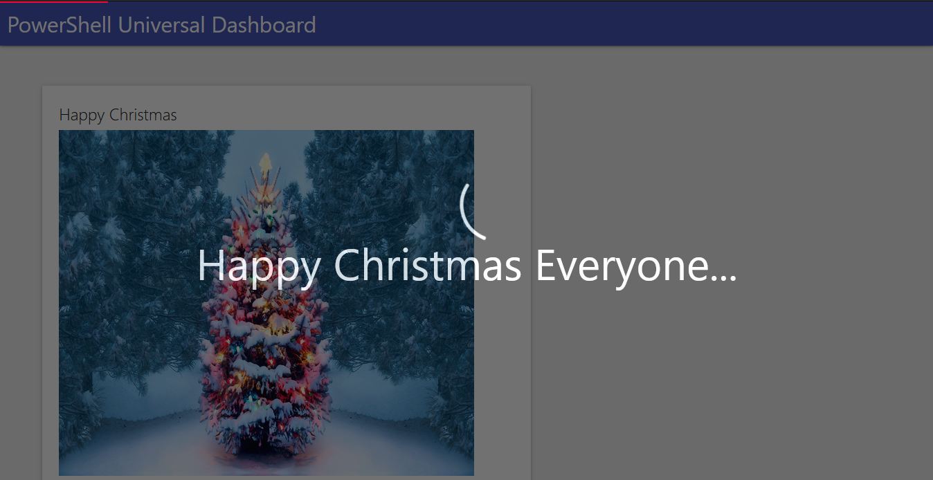
New-UDLoadingOverlay -Id "LOADINGOVERLAY" -Text "Happy Christmas Everyone..." #Defining the page overlay with custom loading text
New-UDRow -Columns {
## Loading lots of running images just to put a load on the dashboard
New-UDColumn -size 7 -Endpoint {
New-UDCard -Title "Testing Loading" -Content {
New-UDImage -Url "https://static.independent.co.uk/s3fs-public/thumbnails/image/2020/04/22/11/how-to-start-running-5k-indybest-0.jpg" -Width 600 -Height 500
}
}
New-UDColumn -size 7 -Endpoint {
New-UDCard -Title "Testing Loading" -Content {
New-UDImage -Url "https://res.cloudinary.com/dt84tw7zr/image/fetch/f_auto,q_auto/https://www.gameplan-a.com/wp-content/uploads/fly-images/14108/running-inspiration-transformation-determination-640x9999.jpg" -Width 600 -Height 500
}
}
New-UDColumn -size 7 -Endpoint {
New-UDCard -Title "Testing Loading" -Content {
New-UDImage -Url "https://www.thetimes.co.uk/imageserver/image/%2Fmethode%2Ftimes%2Fprod%2Fweb%2Fbin%2Ff5167c00-309c-11ea-83aa-e8f0eae9d133.jpg?crop=5560%2C3128%2C28%2C262&resize=1180" -Width 600 -Height 500
}
}
New-UDColumn -size 7 -Endpoint {
New-UDCard -Title "Testing Loading" -Content {
New-UDImage -Url "https://hips.hearstapps.com/hmg-prod.s3.amazonaws.com/images/runningbuildmuscle-1586550834.jpg?crop=1.00xw:0.730xh;0,0.180xh&resize=1200:*" -Width 600 -Height 500
}
}
New-UDColumn -size 7 -Endpoint {
New-UDCard -Title "Testing Loading" -Content {
New-UDImage -Url "https://www.heart.org/-/media/images/news/2019/march-2019/0301distancerunningheart_sc.png" -Width 600 -Height 500
}
}
New-UDColumn -size 7 -Endpoint {
New-UDCard -Title "Testing Loading" -Content {
New-UDImage -Url "https://cdn.vox-cdn.com/thumbor/KO_gWQtcDEpfVrmVFuJnb9EYHo0=/0x40:1000x790/1200x800/filters:focal(0x40:1000x790)/cdn.vox-cdn.com/uploads/chorus_image/image/46889290/shutterstock_266758136.0.0.jpg" -Width 600 -Height 500
}
}
New-UDColumn -size 7 -Endpoint {
New-UDCard -Title "Testing Loading" -Content {
New-UDImage -Url "https://media.wired.com/photos/59322fcf26780e6c04d2a348/16:9/w_929,h_523,c_limit/running-pain-inline.jpg" -Width 600 -Height 500
}
}
New-UDColumn -size 7 -Endpoint {
New-UDCard -Title "Testing Loading" -Content {
New-UDImage -Url "https://www.polar.com/blog/wp-content/uploads/2020/02/What-is-mindful-running-main.jpg" -Width 600 -Height 500
}
}
New-UDColumn -size 7 -Endpoint {
New-UDCard -Title "Testing Loading" -Content {
New-UDImage -Url "https://upload.wikimedia.org/wikipedia/commons/thumb/a/a3/Ludovic_and_Lauren_%288425515069%29.jpg/1200px-Ludovic_and_Lauren_%288425515069%29.jpg" -Width 600 -Height 500
}
}
New-UDColumn -size 7 -Endpoint {
New-UDCard -Title "Testing Loading" -Content {
New-UDImage -Url "https://i0.wp.com/post.healthline.com/wp-content/uploads/2020/01/Runner-training-on-running-track-1296x728-header-1296x728.jpg?w=1155&h=1528" -Height 500 -Width 600
}
}
New-UDColumn -size 7 -Endpoint {
New-UDCard -Title "Testing Loading" -Content {
New-UDImage -Url "https://www.sciencemag.org/sites/default/files/styles/article_main_large/public/1036780592-1280x720.jpg?itok=QykjHcAC" -Height 500 -Width 600
} #Now on the last image loading I am checking the progress value which is between 0 and 1 on the top progress bar
$Session:Loader = (Get-UDElement -id "TOPLOADINGBAR").Attributes['progress']
If (!$Session:Loader) { $Session:Loader = 0 }
if ($Session:Loader -lt 1) {
Set-UDElement -id "TOPLOADINGBAR" -Attributes @{
hidden = $true
show = $false
}
Set-UDElement -id "LOADINGOVERLAY" -Attributes @{
hidden = $true
active = $false
}
}
else {
Set-UDElement -id "TOPLOADINGBAR" -Attributes @{
hidden = $true
show = $false
}
Set-UDElement -id "LOADINGOVERLAY" -Attributes @{
hidden = $true
active = $false
}
}
#Just done a button to prove this could make the top progress bar hide
New-UDButton -Text "Button" -OnClick {
Set-UDElement -id "TOPLOADINGBAR" -Attributes @{
hidden = $true
show = $false
}
}
}
}
} -EndpointInitialization $init
)
TopBar Loading Parameters
    param(
        [Parameter()]
        [string]$Id = (New-Guid).ToString(), #Id for component
        [Parameter()]
        [string]$Color = "#485696", #Initial color of the loading bar
        [Parameter()]
        [string]$BackgroundColor = "#FC7A1E", #background color of the loading bar
        [Parameter()]
        [int]$Thickness = 2, #the thickness of the top progress bar
        [Parameter()]
        [int]$ProgressDuration = 1000 #lower values seem to stagger the animation more this is nice and smooth loading
    )
Page Overlay Loading Parameters
    param(
        [Parameter()]
        [string]$Id = (New-Guid).ToString(), #Id for the component
        [Parameter()]
        [bool]$Active = $true, #If the component should show on the page or not
        [Parameter()]
        [string]$Text, #custom text to display below the page spinner
        [Parameter()]
        [int]$FadeSpeed = 800 #fading speed in milliseconds of the component
    )
I Want To Choose A Custom Spinner
Ok well I did try this, and found the cool folding box animation loader that I thought yeah this will be cool to use, well after downloading the dependencies for this the package was like just over 1 megabyte in size. Obviously this affected the load time of the component, and well it didn’t go to plan, so I decided to stay with the default spinner provided with this component. However by all means you can purchase my course, find out how to bind the components to the dashboard, and make your own version of this.
Conclusion
As mentioned this Christmas has been a tad different from any previous Christmas I have. I hope these two additional components to the marketplace make a awesome stocking filler for your dashboard. I didn’t plan on making two more additional components, but once I had the top bar loading progress working I thought the other page overlay component was the icing on the cake, well for me anyway. So to give you the choice instead of bundling this into one component I built these as two separate components. I think they both work really nicely together, and do not take a lot of code to implement on a dashboard page. I think for any long loading pages you have, these components will grab the user attention to make the wait less painless, and you can show off how fancy your dashboard is and responsive.