4 min to read
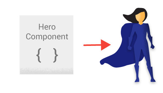
New Hero Component
A new component great for a landing page
Welcome
To try and keep the momentum flowing I have thought of another useful component to build and release to the world. Amazingly it was pretty much staring me in the face for the last year or so, and I never really thought about it. Well what am I on about, a hero of course. And what better time to release such a component when the world is in need, don’t worry I got your back, I got the New-UDHero here to save the day. Well not literally, but this does look super cool.
Please remember you to can also build cool looking custom components like this one, by buying my course on how to create custom components here Which shows how this component was constructed.

What Does This Components Do?
Well I don’t want to sound lame but it doesn’t really do much apart from make your page look freaking awesome! I think this would be great for your first landing page on your dashboard, again I wanted to mimick something I have on this website that is not on the marketplace. If you notice the latest blog is in a bigger picture on the page, which has like an old TV screen overlay, and a bottom gradient bar. I personally really like this, hence it is on my blog site. Well basically this component does exactly what the main hero image does on my blog site. It catches the user attention, provides a nice picture to look at, and allows the user to click on a button to read more. I managed to find a component which also supported the parallax effect on the image being displayed in the hero component so that was an added bonus for sure.
So Why Build This Component?
Because it doesn’t exist already on the marketplace, and is not included as a default command to my knowledge in either UD or PU. Plus I think it looks great on a dashboard page
New-UDHero
Parameters
param(
        [Parameter()]
        [string]$Id = (New-Guid).ToString(), #Allows you to specify an Id for the component
        [Parameter()]
        [string]$Title, #Title to be displayed on the hero
        [Parameter()]
        [string]$Text, #Text to be displayed under the title on the hero
        [Parameter()]
        [string]$Image, #Main image to be used in the hero component
        [Parameter()]
        [ValidateSet("true", "false")]
        [string]$Parallax = "true", #Decided to make parallax on by default
        [Parameter()]
        [string]$Shadow = "rgba(0, 0, 0, 0.78) 0px 0px 44px 0px", #Outer shadow on the hero component
        [Parameter()]
        [string]$TextColor = "#444", #Default text colour
        [Parameter()]
        [string]$ButtonText = "Read More", #Text to be displayed on the button
        [Parameter()]
        [string]$ButtonTextColor = "#FFF", #Button tezt colour
        [Parameter()]
        [string]$ButtonBackgroundColor = "#444", #Button background colour
        [Parameter()]
        [string]$Hyperlink, #Hyperlink for the button to link to /pagename
        [Parameter()]
        [string]$ImageOverlay, #Allows an overlay image like the old TV display on my blog site
        [Parameter()]
        [string]$MarginLeft = "-50px", #Using the default theme there is a 50px left margin
        [Parameter()]
        [string]$MarginRight = "-50px", #Using the default theme there is a 50px right margin
        [Parameter()]
        [string]$MarginTop = "-50px" #Places this just under the main navbar due to default margin
    )
As always I try to give as many defaults as I can to my parameters so the component pretty much needs the minimal parameters supplying to it. Which in this case would be the following paramters TITLE,TEXT,IMAGE,HYPERLINK all need specifying to make this component work as desired.
Demo
So for the exact demo of the GIF I will be using the following code:-
Import-Module UniversalDashboard
Import-Module UniversalDashboard.UDHero"

Get-UDDashboard | Stop-UDDashboard
$dashboard = New-UDDashboard -Title "Powershell Dashboard" -Content {
    New-UDHero -Title "New-UDHero Has Arrived" -Text "More goodness coming to the marketplace" -Image "https://codeclan.com/wp-content/uploads/2020/05/undraw_usability_testing_2xs4.png" -ImageOverlay "url('https://psdevuk.github.io/ud-flix/assets/img/pixels.png')" -TextColor "#F3E1DD" -MarginLeft "-50px" -MarginRight "-50px" -Hyperlink "/somepage"
    New-UDRow -Columns {
        New-UDColumn -size 3 -Content {
            New-UDCard -Title "Another Brand-New Component" -BackgroundColor "#3F51B5" -FontColor "#FFF"
        }
        New-UDColumn -size 3 -Content {
            New-UDCard -Title "For The Mighty Powershell MarketPlace" -BackgroundColor "#3F51B5" -FontColor "#FFF"
        }
        New-UDColumn -size 3 -Content {
            New-UDCard -Title "Make Your Dashboard Look Even" -BackgroundColor "#3F51B5" -FontColor "#FFF"
        }
        New-UDColumn -size 3 -Content {
            New-UDCard -Title "More Amazing With This Component" -BackgroundColor "#3F51B5" -FontColor "#FFF"
        }
        New-UDRow
        New-UDColumn -size 3 -Content {
            New-UDCard -Title "Need A Hero..?" -Content { New-UDHeading -size 5 -text "I got your back covered" -color "#FFF" } -BackgroundColor "#3F51B5" -FontColor "#FFF"
        }
    }
}

Start-UDDashboard -Dashboard $dashboard -Port 10005

Super Easy To Implement
New-UDHero -Title "You need a title" -Text "and a bit of text" -Image "https://codeclan.com/wp-content/uploads/2020/05/undraw_usability_testing_2xs4.png" -Hyperlink "/somepage"
Thats all you need to include at the top of your dashboard script file to get this hero to look gorgeous
Conclusion
Although I have seen this effect on my blog site for just over a year now, believe it or not I just for what-ever reasons never bothered looking at implementing this to a dashboard environment. Not sure why, as I really liked the hero image effect on this blog site, and I hope it finds it’s way to your dashboard you are building or have released. I will be publishing this to the powershell gallery soon.