7 min to read
GitHub Styled HeatMap Contribution Calendar
HeatMap chart that you can completely customise
Welcome
I didn’t expect to be writing another blog so soon, and there was no immediate request or deal-breaker that required this component to be built. I saw this component on npmjs.com and just thought this would make a really good component for UniversalDashboard. I mean I went all-out in my job and designed this stock-take heatmap which would easily show the person doing the stock at my work future orders for stock. Sadly for what-ever reasons this is not used at my work, even though it is an amazing way to view lots of information in a calendar period. Anyways after seeing this, I was thinking of the cool uses I could use it for, and the customisations you can do in this chart which you do not seem to be able to do with the Nivo chart set that comes with the enterprise edition of UniversalDashboard. Only after building this component did I come across this forum post which made me happy as there is now a way you can do this using this newly built component.
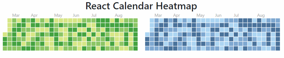
React-Calendar-Heatmap
Well personally I think github is amazing, and lets you do lots of stuff for free like me hosting this blog website. Yep it’s on github and I am using github to run this website. As well as being amazing it does have a rather sweet looking contribution heatmap chart to show you your activity on github. This component is exactly that replicating the look and feel of the github contribution heatmap So after finding the documentation for this component, I got it to build and display the data in a reasonable amount of time. What gave me the proper headache with this component, was implementing the tool-tip which is another component, so you getting a double-whammy with this component as it is using two components react-calendar-heatmap and react-tooltip Sadly the documentation wasn’t a 100% clear on how to use the react-tooltip, and I saw various issues people were having getting the tooltip to work. After many hours, and many rebuilds I finally got this working. If you are interested in the underlying JSX I had to write here it is
import React from 'react';
import ReactDOM from 'react-dom';
import CalendarHeatmap from 'react-calendar-heatmap';
import ReactTooltip from 'react-tooltip';
import './styles.css';

class GitHubHeatMap extends React.Component {

  // state is for keeping control state before or after changes.
  state = {
    values: this.props.values,
    hidden: false
  }
  componentWillMount() {
    this.pubSubToken = PubSub.subscribe(this.props.id, this.onIncomingEvent.bind(this));
    ReactTooltip.rebuild()
  }

  componentWillUnmount() {
    PubSub.unsubscribe(this.pubSubToken);
  }
  onIncomingEvent(eventName, event) {
    if (event.type === "requestState") {
      var data = {
        attributes: {
          values: this.state.values,
          hidden: this.state.hidden
        }
      }
      UniversalDashboard.post(`/api/internal/component/element/sessionState/${event.requestId}`, data);
    }
    else if (event.type === "setState") {
      this.setState(event.state.attributes);
    }
    else if (event.type === "clearElement") {
      this.setState({
        values: ''
      });
    }
    else if (event.type === "removeElement") {
      this.setState({
        hidden: true
      });
    }
  }

  getTooltipDataAttrs = (value) => {
    // Temporary hack around null value.date issue
    if (!value || !value.date) {
      return null;
    }

    if (value.date && value.count) {
      return {
        'data-tip': `Date ${value.date.slice(0, 10)} has the value ${value.count} `,
      }
    }
    // Configuration for react-tooltip
    return {
      'data-tip': ` ${value.date} `,
    };
  };
  render() {
    if (this.state.hidden) {
      return null;
    }

    return (
      <div>
        <CalendarHeatmap
          startDate={new Date(this.props.startDate)}
          endDate={new Date(this.props.endDate)}
          values={this.props.values}
          classForValue={(value) => {
            if (!value) {
              return 'color-empty';
            }
            return `color-scale-${value.count}`;
          }}
          tooltipDataAttrs={this.getTooltipDataAttrs}
          showMonthLabels={this.props.showMonthLabels}
          showWeekdayLabels={this.props.showWeekdayLabels}
          horizontal={this.props.horizontal}
          gutterSize={this.props.gutterSize}
        />
        < ReactTooltip />
      </div>

    )

  }
}

export default GitHubHeatMap
As you may or maynot have noticed, but there is also a custom cascading style sheet to this component, although sadly I am not using it, as I am going for the custom class name of the actual value returned to the heatmap color-scale-${value.count} this is the CSS equivalent
.react-calendar-heatmap .color-scale-8 { fill: #A8AAF2;}
So if the value in question is the number 8 it will style the cell in the colour #A8AAF2. To try and be helpful, in the custom CSS I did from values 1 to 100. So they will get styled automatically, for numbers outside that range, you the user can create your own CSS theme to handle the colour layout.
Demo

In this demo I was using the DarkRounded theme so wanted to make my Github Heatmap component match the look and feel of the current dashboard. In the below demo code you will notice I am setting .react-calendar-heatmap text in my theme, this is the text displayed on the outer-side of the heatmap the month names and weekday names. I also adjusted .react-calendar-heatmap .color-empty and changed this colour to black to match that of my dashboard, as I didn’t want a glaring white beam of lots of cells, as the default colour is a white colour
GitHub Heatmap
If you haven’t read my last blog post then please do, as this component also uses a script block with a 2 dimension array to display the data. I made a basic CSV file to show the data. The contents of my CSV file were
Date,Sales
2020-07-03,40
2020-07-04,22
2020-07-05,12
2020-07-06,3
2020-07-07,79
2020-07-08,65
2020-07-09,65
2020-07-10,89
2020-07-11,19
2020-07-12,1
2020-07-13,13
2020-07-14,15
2020-09-01,77
2020-09-02,54
2020-09-03,34
2020-09-04,21
2020-09-05,8
2020-09-06,2
2020-09-07,4
2020-09-08,9
2020-09-09,7
2020-09-10,44
2020-09-11,32
2020-09-12,11
2020-09-13,25
I then used this CSV file to populate the data in the heatmap
Import-Module UniversalDashboard
Import-Module UniversalDashboard.GitHubHeatMap

Get-UDDashboard | Stop-UDDashboard

$Theme = New-UDTheme -Name "demo" -Definition @{
    '.react-calendar-heatmap text'         = @{
        'font-size' = "8px !important"
        'fill'      = "antiquewhite !important"
    }
    '.react-calendar-heatmap .color-empty' = @{
        'fill' = "#000 !important"
    }
} -Parent "DarkRounded"
$dashboard = New-UDDashboard -Title "New-GitHubHeatMap" -theme $Theme -Content {
    New-UDRow -Columns {
        New-UDColumn -size 6 -Content {
            $List = import-csv C:\ud\HeatMap\Book1.csv
            $hash = @()
            foreach ($item in $List) {
                $hash += @{
                    count = [int]$item.Sales
                    date  = (get-date $item.Date)
                }
            }
            New-GitHubHeatMap -Id "HEATMAP" -Values { $hash } -StartDate "2020-06-01" -EndDate "2020-10-01" -GutterSize 2 -Horizontal $false
        }
    }
}

Start-UDDashboard -Dashboard $dashboard -Port 10005
Parameter List
      [Parameter()]
        [string]$StartDate = "2020-01-01",
        [Parameter()]
        [string]$EndDate = "2020-12-01",
        [Parameter()]
        [scriptblock]$Values,
        [Parameter()]
        [bool]$MonthLabels = $true,
        [Parameter()]
        [bool]$WeekLabels = $true,
        [Parameter()]
        [bool]$Horizontal = $true,
        [Parameter()]
        [int]$GutterSize = 2
So in total there are 7 parameters for this component, they are all listed above, and you can see that all the parameters apart from -Values have all been given default values to the parameter. All of these parameters should be pretty clear in what they do, the -GutterSize is to control the size of the square cells returned. Hopefully the rest are pretty self-explanatory in what they do.
Conclusion
You can download the component right here from the powershell gallery
I found this a super tough component to build, as I am no react developer, but just trying to get the tooltip to display was so frustrating. I know this component is far from perfect, as you will have to most likely implement your own CSS as I only cover from the values 1 to 100. Thankfully I do have a blog on using CSS to style your dashboard, in-fact I have two blogs but this is my latest and if you have a butchers at that blog post, then I am sure you will be able to design your own theme style for your data in this component. Please remember the date formats should be in YYYY-MM-DD format, as that is the type being used on the demo pages, so stuck with that when passing the data in the hashtable array.
If you have a collection of dates and a value, then please do have a go at using this component. Thank you for reading.