6 min to read
GitHub Social Component
Dedicated Github component to jazz up your dashboard

Welcome
As always welcome to my blog page. If this is your first blog of mine you are ready then please do explore my other blogs, and if there is something you think could be added drop me a tweet at @psdevuk
If this is not your first time to my blog page, thank-you very much for returning once again to read another blog. I’m still buzzing about UniversalDashboard and I know it is not the latest in the line of amazing products Mr Adam Driscoll has released but to me it’s like Github I love it.
So yeah this is another Github inspired component. I came across this webpage and was like, yeah I got to build this as another custom component for UniversalDashboard maybe to show my colleagues that I am a Github addict.
React Social Github
So I had a good live webpage that did the demo for this component very nicely. However after building it with all the parameters, I couldn’t display just information on the user. I did notice that on the webpage that showed this component, that the repo tag was not present. So I thought I could be clever and write a multi-parameter list set for the function, one that did include the repo and one that did not. Well it still failed, when pressing F12 and inspecting the component using the FireFox add-on for react I was able to see that the repo prop was still present in the component although it wasn’t being passed. So I did a half-job and instead of trying to learn some JSX react development to dynamically include this or not, I went for choice B which was to simply make another component.
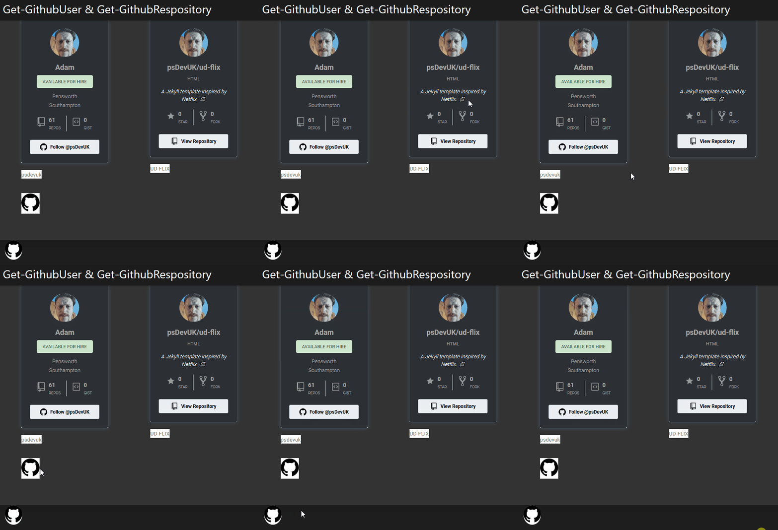
I bring you 2 Github components to play about with Get-GithubUser and Get-GithubRepository and hopefully with the naming convention, you can figure out, that the first function mentioned will only bring back the user information, and the second function mentioned will display information on a specific repository.
As mentioned already you can see this component live in a web browser here so without further rambling, lets get on to a good demo of how to use this component in your dashboard you are building.
Demo

Code From The Demo
Import-Module UniversalDashboard
Import-Module UniversalDashboard.GithubUser
Import-Module UniversalDashboard.GithubRepository
Get-UDDashboard | Stop-UDDashboard
#$endpointinit = New-UDEndpointInitialization -Module @("UniversalDashboard.UDNumber")
$Theme = New-UDTheme -Name "demo" -Definition @{
    '.rsg-github-wrapper' = @{
        'background' = "#2c3035 !important"
    }
    '.rsg-github'         = @{
        "display"     = 'inline-block'
        "font-family" = 'Roboto,sans-serif'
        "color"       = '#a8a8a8 !important'
        "padding-top" = '1px'
    }
} -Parent "DarkRounded"
$dashboard = New-UDDashboard -Title "Get-GithubUser & Get-GithubRespository" -theme $Theme -Content {
    New-UDRow -Columns {
        New-UDColumn -size 3 -Content {
            Get-GithubUser -Username "psdevuk"
New-UDRow
Get-GithubUser -Username "psdevuk" -Type "link" -LinkText "psdevuk"

        }
 New-UDColumn -size 3 -Content {
Get-GithubRepository -Id "REPOSITORY" -Username "psdevuk" -Repository "ud-flix"
 New-UDRow
            Get-GithubRepository -Id "REPOSITORY1" -Username "psdevuk" -Repository "ud-flix" -Type "link" -LinkText "UD-FLIX"

}
       New-UDColumn -size 3 -Content {
 }
New-UDColumn -Size 3 -Content {
                   }
        New-UDColumn -size 10 -Content {
New-UDRow
New-UDRow
            Get-GithubUser -Type "button" -Username "psdevuk" -IconHeight 50 -IconWidth 50 -fab $false
            Get-GithubRepository -Id "REPOSITORY2" -Type "button" -Username "psdevuk" -Repository "ud-flix" -fab $true -position "bottom-left"
        }
    }
}

Start-UDDashboard -Dashboard $dashboard -Port 10005
In this demo I was using the DarkRounded theme so wanted to make my Github social components match the look and feel of the current dashboard. So in the above code you will notice that I have used a custom theme which is the CSS related to these components, which I tweaked to match the dashboard theme. I do have 2 blogs on how to use CSS on your dashboards.
Parameter List
So both these components have the exact same parameters except that the Get-GithubUser does not include the -Repository parameter everything else is the same so apart from this one parameter -Repository all the others are exactly the same. Here is the parameter list from Get-GithubRepository which does include the -Repository parameter
function Get-GithubRepository {
    param(
        [Parameter()]
        [string]$Id = (New-Guid).ToString(),
        [Parameter(Mandatory)]
        [string]$Username,
        [Parameter(Mandatory)]
        [string]$Repository,
        [Parameter()]
        [string]$LinkText,
        [Parameter()]
        [bool]$Fab = $false,
        [Parameter()]
        [bool]$ToolTipOnHover = $true,
        [Parameter()]
        [ValidateSet('widget', 'button', 'link')]
        [string]$Type = 'widget',
        [Parameter()]
        [ValidateSet('bottom-right', 'bottom-left', 'top-right', 'top-left')]
        [string]$Position,
        [Parameter()]
        [string]$IconColor,
        [Parameter()]
        [int]$IconWidth,
        [Parameter()]
        [int]$IconHeight

    )
I hope after giving some sample code, and having a website to test this component in to figure out what parameters you want to call, that you will add this to your dashboard. You can now find this Github repository social component listed right here for download and I have listed the Github user social component right here for download
But wait there’s more…
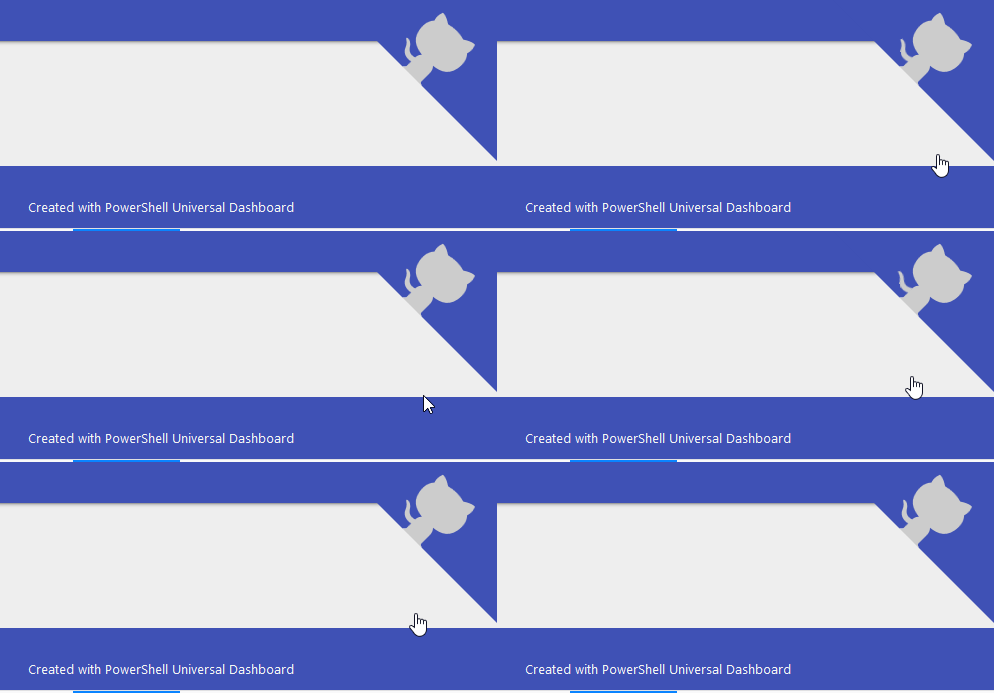
Ok since developing this component I found this really sweet looking Github component so I went to work on building this as a component and everything worked as expected. All the parameters listed on the npmjs page have been included into this component. So it’s very simple to use and looks great on a dashboard
![]()
## Demo Code
 Import-Module UniversalDashboard
Import-Module UniversalDashboard.GithubCorner
Get-UDDashboard | Stop-UDDashboard
$dashboard = New-UDDashboard -Title "New-GitCorner" -Content {
    New-GithubCorner -id "Github_Corner" -HyperLink "https://github.com/psDevUK" -Size 120 -Color "#FFD447" -Background "#3f51b5" -Position "right" -zIndex 1
}

Start-UDDashboard -Dashboard $dashboard -Port 10005
## Parameter List
  param(
        [Parameter()]
        [string]$Id = (New-Guid).ToString(),
        [Parameter()]
        [string]$HyperLink,
        [Parameter()]
        [int]$Size,
        [Parameter()]
        [ValidateSet("left", "right")]
        [string]$Position,
        [Parameter()]
        [string]$Color,
        [Parameter()]
        [string]$Background,
        [Parameter()]
        [int]$zIndex,
        [Parameter()]
        [bool]$Fixed = $false
    )
So yeah maybe I could of used OctoCat instead of Color but I think this component is easy enough to understand with the parameters, that I will not ramble on about them. Well I could see this being added to the I.T dashboard I got at work, to remind me homies that this kid is part of something bigger, the github community
 Just as I think this component looks so sweet, I thought I would include two demo GIFs to go with it. I hope this finds its way to your dashboard real soon.
Conclusion
I thought this was another good mini project to build these components for UniversalDashboard and hopefully you have enjoyed reading about it, and maybe just maybe it might find a way to your dashboard. Or if you just want to big-up this website then you have my full permission to include a fab on every page linking to the ud-flix repository I created to host and maintain this webpage.
Once again thank you for reading.

